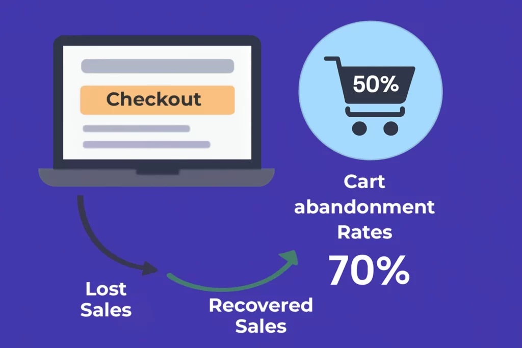
Did you know that the average cart abandonment rate for e-commerce stores hovers around 70.19%?
That’s a staggering statistic! For dropshipping businesses,
This number can be even higher due to longer shipping times and trust concerns.
But here’s the thing Most of these lost sales happen right at the checkout page.
I’ve been optimizing e-commerce funnels for over a decade,
And I can tell you that the checkout process is where dreams go to die…
Or where smart entrepreneurs turn browsers into buyers!
The difference between a 30% conversion rate and a 70% cart abandonment rate often comes down to
How seamless and trustworthy your checkout experience feels.
In this comprehensive guide,
We’ll dive deep into seven battle-tested strategies that can dramatically
Reduce your cart abandonment rates and boost your dropshipping profits.
Okay, rubs hands together. Cart abandonment in dropshipping?
Man, that’s a raw nerve for anyone in this game.
Let’s dive into this beast, based on… well,
Let’s just say some expensive lessons learned the hard way.
1. Understanding Cart Abandonment in Dropshipping Stores
Alright, let’s get real.
Seeing that “Items in Cart” notification only for it to vanish into thin air? It stings.
Worse, it happens WAY more often in dropshipping than folks might think.
Industry benchmarks? Yikes.
While the average e-commerce cart abandonment rate
Hovers around a still-painful 54.02% (according to SaleCycle, 2024),
Abandonment is typically higher on mobile than desktop; many sites see 80%+ on mobile,
But it varies by UX and audience, not just by business model.
Let that sink in.
For every 100 people who think “Hmm, maybe I want this,”
Only about 15 actually pull the trigger.
The rest? Poof. Gone.
That difference isn’t random
It’s baked into the dropshipping model itself.
Why is dropshipping abandonment so uniquely brutal?
After wrestling with this for years (and yes, losing plenty of sleep over it),
A few key culprits stand out,
Way more than in traditional shops where you control stock and shipping:
1- The Shipping Cost & Speed Shock:
This is the biggie, the one I totally underestimated starting out.
Customers click “checkout,” full of excitement,
Only to see shipping costs that feel like a gut punch.
Especially if they were buried until the last second
(guilty as charged, I used to do this!).
Or worse, they see the estimated delivery window:
“14-35 business days?!” That “two months?!”
Realization kills momentum stone dead.
Traditional stores often have faster, more predictable shipping, softening this blow.
In dropshipping, especially sourcing from places like AliExpress,
Those long lead times are a massive conversion killer.
People want instant gratification, or at least predictable gratification.
Which, honestly, reminds me of that time I ordered a cool gadget myself,
Saw the delivery estimate after paying, and immediately felt buyer’s remorse.
Lesson learned!
2- Trust Gaps:
Let’s be honest, some folks still side-eye dropshipping stores.
“Is this legit?”
“Where is this really coming from?”
“Will I get a cheap knockoff?”
If your site looks sketchy,
Lacks clear policies (returns are a whole other anxiety!),
Or uses obviously generic product images/videos,
Trust evaporates.
Unlike a known brand like Amazon or even a local boutique,
You’re building trust from zero.
Unexpected costs or slow shipping feeds right into those fears.
3- Unexpected Costs (Beyond Shipping):
Taxes, handling fees, payment processing fees tacked on at the end
It all adds up.
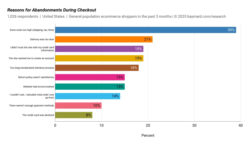
Baymard Institute cites unexpected costs as the #1 reason for abandonment overall,
Affecting nearly 39% of bail-outs.
In dropshipping,
Where margins can be tight and you might be tempted to hide fees,
This is a death wish.
Transparency early is non-negotiable.
I learned that after analyzing my own checkout funnel
And seeing a huge drop-off the moment taxes appeared.
Ouch.
3- Complicated Checkout:
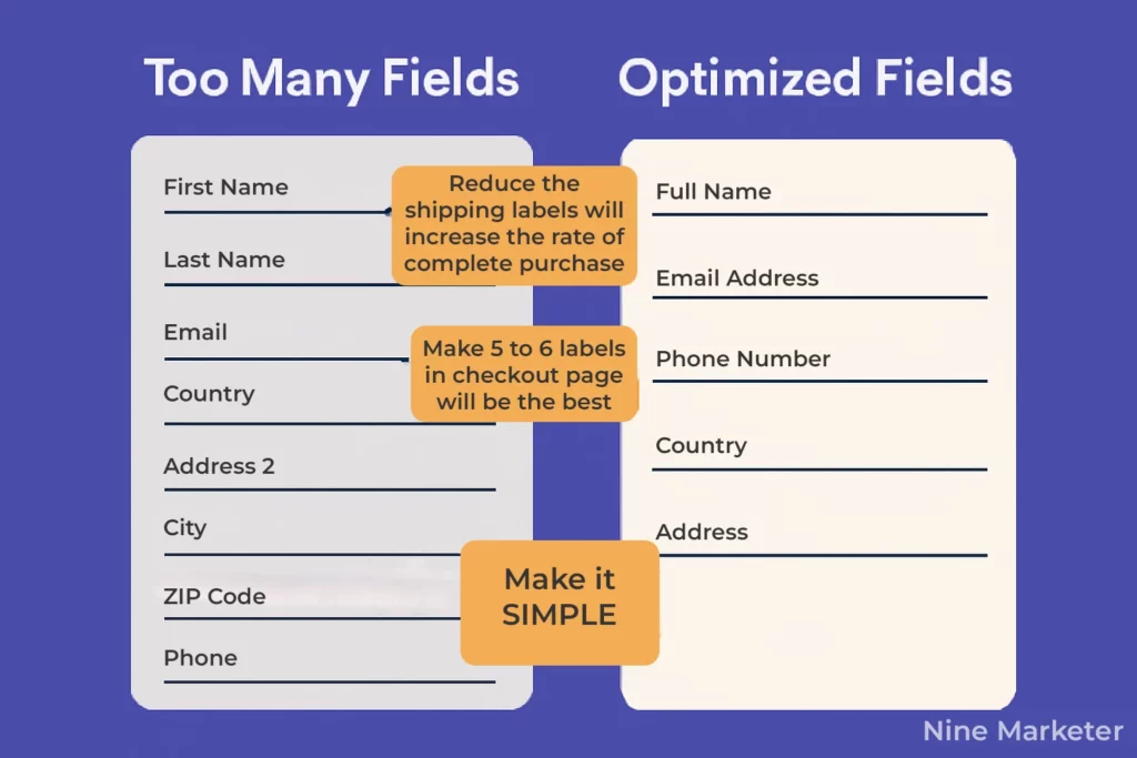
Making people jump through hoops?
Creating an account?
Too many form fields?
Each step is a chance for doubt to creep in.
Keep it stupidly simple.
Guest checkout is your friend.
Autofill is your bestie.
4- The Psychology Bit:
It boils down to friction and fear.
The checkout process should feel like sliding into home plate,
Not running an obstacle course.
Every extra click, every surprise cost, every vague promise
(“ships sometime soon!”) triggers hesitation.
People second-guess.
They compare.
They get distracted.
The “buy now” impulse fades fast,
Replaced by logic and caution.
Dropshipping inherently has more potential friction points
(shipping time being the elephant in the room),
So minimizing everywhere else is critical.
The Revenue Hit? It’s Devastating.
Seriously, do the math.
Say your store gets 100 visitors a day.
With an 85% cart abandonment rate, only 15 complete purchases.
If your average order value (AOV) is $50, that’s $750/day.
But if you could halve that abandonment rate to,
Say, 42.5% (still high, but better), you’d get 57.5 sales.
That’s $2,875/day.
You’re potentially leaving over $2,000 PER DAY on the table.
Multiply that by 30 days?
That’s $60,000+ lost revenue every month.
That’s not just a leak; that’s a flood.
It directly impacts your ability to scale, to profit, to even stay afloat.
Conversion rate optimization (CRO) isn’t just a buzzword; it’s survival.
5- Patterns & Seasons:
Watch your analytics like a hawk!
Abandonment often spikes around holidays
People are browsing gifts, adding tons to carts for comparison.
But budget constraints hit hard in December.
January sees abandonment driven by post-holiday spending guilt and price sensitivity.
You might also see patterns based on traffic source
Maybe social media traffic has higher abandonment because it’s more impulsive,
While search traffic might be more considered.
Understanding these dropshipping-specific nuances
Helps you tailor your recovery strategies (abandoned cart emails!) and timing.
The bottom line?
Cart abandonment in dropshipping is a massive,
Complex beast fueled by the model’s inherent challenges.
But understanding why it happens
The specific stats,
The unique reasons compared to traditional stores,
The psychology,
The brutal revenue impact, and the seasonal swings
Is the absolute first step to fighting back.
You can’t fix what you don’t understand.
Next, we’ll talk tactics for plugging those leaks!
2. Streamline Your Checkout Process for Maximum Conversions
Look, getting someone to actually click “Buy Now” is a mini miracle in dropshipping.
Seeing them vanish at the checkout stage?
Pure agony.
I used to have this ridiculously long, multi-step process
address here, shipping there, payment way over there.
Felt like running an obstacle course just to give me money!
Turns out,
Industry data is brutal:
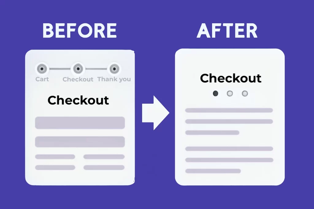
Extra steps reliably add friction and increase drop-off, streamline the flow and remove non-essential fields.
Switching to a single-page checkout
Was a game-changer for my conversion rate optimization (CRO).
Seriously,
Condensing everything onto one scrollable screen reduced confusion massively.
People could see the whole deal
Product, cost, shipping, total
Without clicking “Next” and wondering if they’d lose their progress.
Some folks argue multi-step feels less overwhelming,
But honestly?
In my split tests (A/B testing is crucial here!),
The single-page consistently won out, boosting completions by about 15% for my store. It just feels faster, and speed is king when sealing the deal.
But the real devil is in the details,
Those form fields. Early on,
I was asking for everything but their blood type.
Phone number? Mandatory.
Company name? Yep, even for consumers.
Birthday? Why not?!
Big mistake.
Unnecessary fields create friction points like nobody’s business.
Baymard Institute A recent analysis shows that 65% of top e-commerce sites
In the US and Europe deliver a “mediocre” or
Poorer Checkout UX, while only 2% achieve a “good” rating.
That’s insane!
I ruthlessly cut mine down.
Unless you absolutely need it for shipping or fraud prevention
(like the billing address for card verification),
Ditch it.
Do you really need their phone number before they’ve even bought?
Probably not.
Make only the email and essential shipping/billing details mandatory.
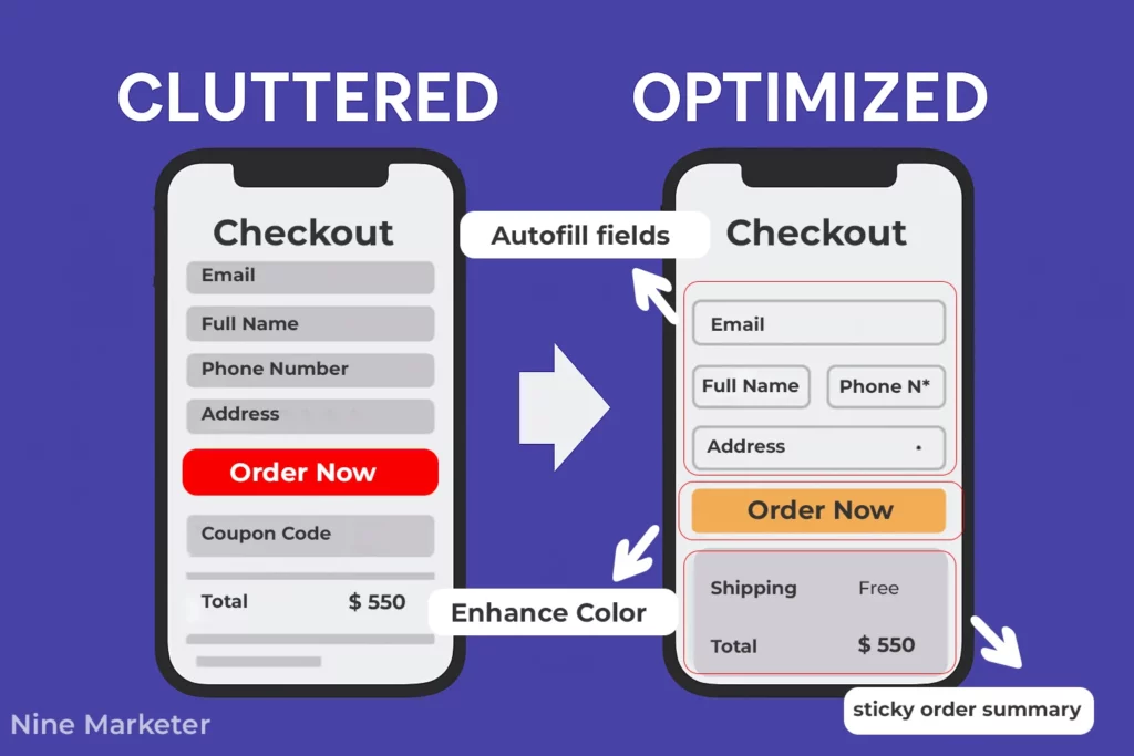
Auto-fill helps,
But fewer fields is fundamental.
It’s about reducing cognitive load and making it easy.
And for the love of all things profitable,
Enable guest checkout!
I used to force account creation,
Thinking it was great for retargeting.
Spoiler: it wasn’t.
It was great for losing sales.
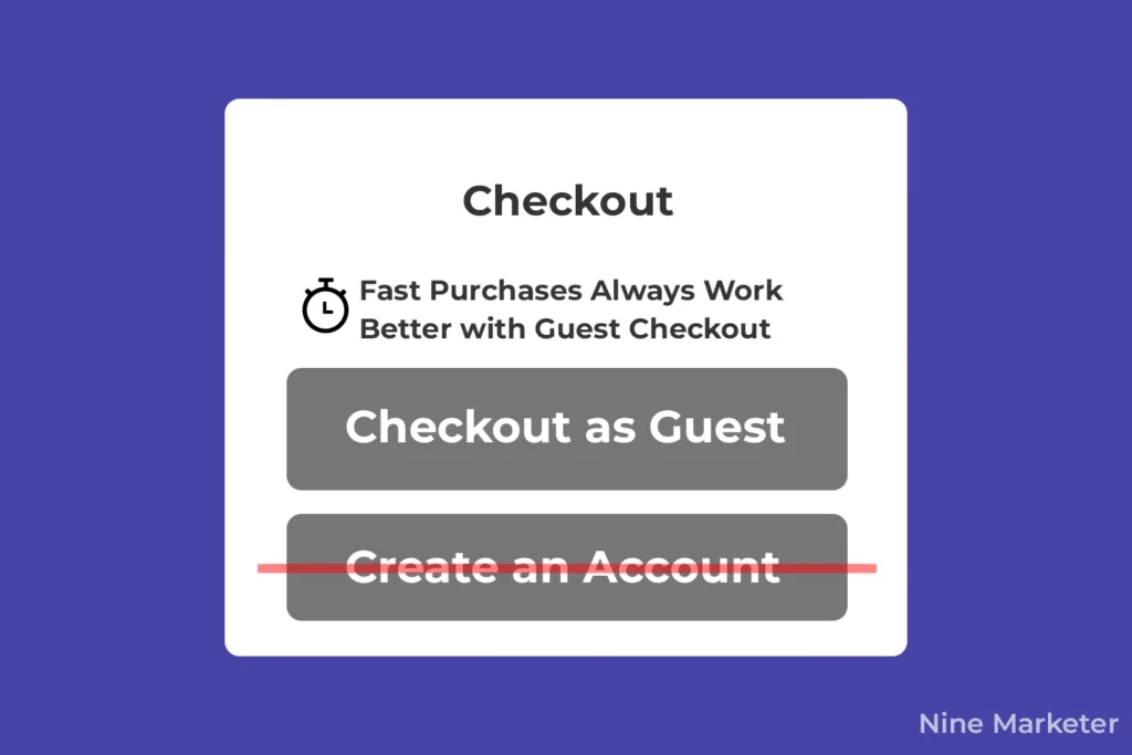
People hate registering,
Especially if they just want one thing.
Registration barriers are a massive conversion killer.
Offering a clear “Guest Checkout” or “Continue as Guest”
Button right upfront is non-negotiable.
You can ask if they want to save their info after the purchase is done.
Much less pressure.
This simple switch alone recovered a bunch of sales
I was just throwing away.
Think about your own behavior
How often do you bail if a site makes you sign up before buying?
Optimizing for mobile and desktop
Users separately is also huge.
What looks fine on your big monitor can be a nightmare on a phone.
On mobile, that single-page checkout shines even brighter.
But test everything!
Buttons need to be fat-finger friendly.
Forms need big, responsive fields.
Auto-advance to the next field helps.
On desktop,
Maybe you have a bit more screen real estate
For a cleaner two-column layout showing the order summary alongside the form.
The key is ensuring the checkout flow
Feels intuitive and effortless regardless of the device.
Load times matter too
A slow checkout on mobile is basically a “close tab” trigger.
Progress indicators are a small touch with big impact.
People like knowing where they are and how much is left.
A simple bar or “Step 1 of 3” text reduces anxiety.
My old, unmarked multi-step was terrifying
People had no clue if they were halfway or just starting!
Just make sure it’s accurate.
Nothing worse than a progress bar that jumps from “Step 1” to “Done!”
With nothing in between, or worse,
Showing “Step 3 of 4” when there are actually 5 steps.
That breeds distrust.
Keep it simple and honest.
Finally,
Never assume you’ve got it perfect.
A/B testing strategies for checkout page layouts are your best friend.
Seriously,
Test everything:
- Button color and text: “Pay Now” vs. “Complete Purchase” vs. “Secure Checkout”.
- Placement of trust signals: Security badges, guarantees – where do they reassure most?
- Shipping cost display: Show it earlier? Calculator vs. flat rate display?
- Order summary visibility: Always visible sticky box? Or only at the end?
- Even the number of fields: Test versions with absolutely minimal fields vs. your standard.
Start small. Pick one element to test at a time. I once saw a 11% lift just by changing a button from grey to a brighter green! Dedicated tools CRO platforms make this accessible. Data beats gut feeling every single time when it comes to checkout optimization.
Streamlining checkout isn’t about fancy tricks;
It’s about ruthless simplification and
Understanding the customer’s desire for speed and security.
Cut the clutter,
Guide them clearly,
Make it painless on any device,
And always be testing.
Those conversions you’re missing?
They’re probably hiding behind
An unnecessary field or a confusing step.
Go find ‘em!
3. Build Trust Through Transparent Pricing and Policies
Alright,
Let’s get brutally honest here:
Nothing murders trust in dropshipping
Faster than hidden costs or shady policies.
I learned this the hard way.
Early on,
I’d list a product for $29.99,
Customers would click checkout,
then—bam!
shipping doubled the price,
Taxes added another layer,
And a vague “processing fee”
Popped up like an unwelcome guest.
Cart abandonment skyrocketed.
No surprise, right?
People felt ambushed.
And trust me,
Once that trust is broken?
They rarely come back.
The Upfront Cost Revolution
First lesson:
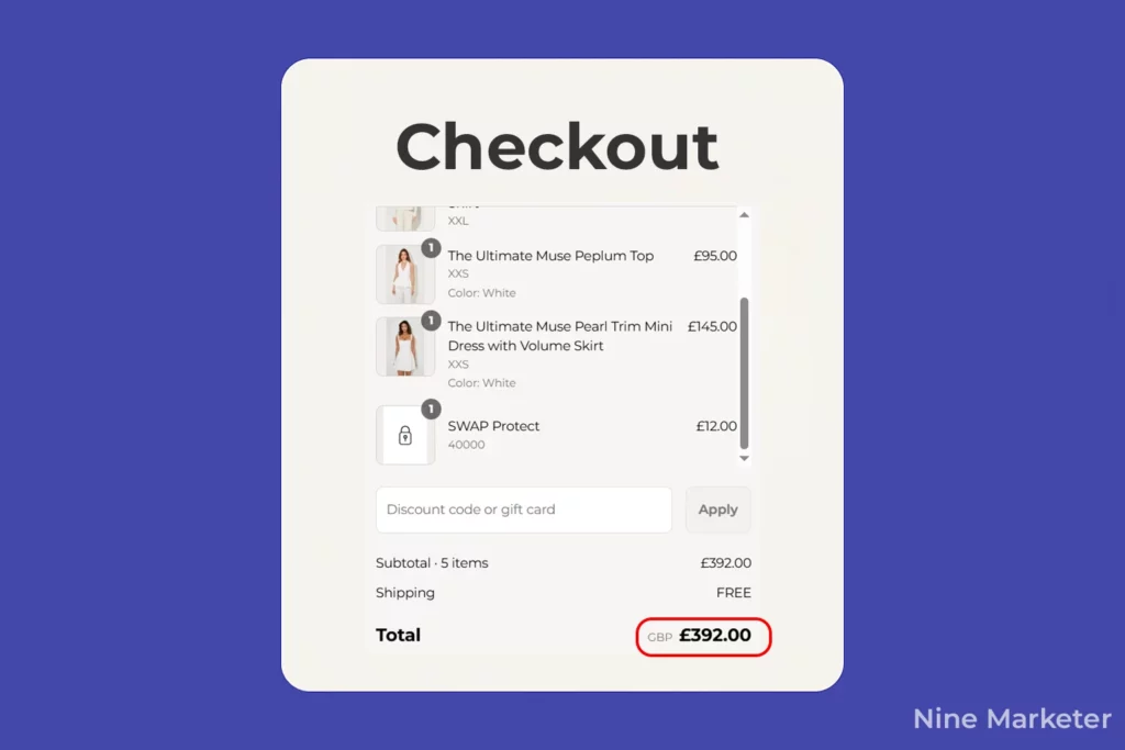
Display EVERY cost early.
Not just on the checkout page
I’m talking product pages, cart summaries, everywhere.
If shipping from China takes 3 weeks and costs $8.99,
Say it upfront.
If taxes apply,
Estimate them dynamically before checkout.
Tools like Shopify’s tax calculator or apps like “Better Replay” saved my skin here.
One store I worked with saw a 22% drop in abandonment
Just by adding shipping estimates to product pages.
It’s simple psychology: surprises feel like traps.
Transparency feels like respect.
Return Policies: No Fine Print Allowed
Returns are the elephant in the room for dropshipping.
Long shipping times,
Quality concerns – it’s messy.
But hiding your policy?
Bigger mistake.
I used to bury mine in a footer link (cringe).
Now?
I plaster it everywhere:
product pages,
checkout banners,
even order confirmation emails.
Key specifics:
- Who pays return shipping? (I bite the bullet—it builds loyalty).
- Timeframe: 30 days? 60? Be obsessive about clarity.
- Condition rules: “Unopened” vs. “lightly used” avoids nightmares.
Pro tip: Film a short video explaining your policy. Seeing a real human say, “We’ve got your back” works wonders.
Trust Badges & SSL: Your Digital Handshake
Let’s be real
If your site looks sketchy,
Pricing won’t matter.
Early on,
I ignored SSL certificates (“It’s just a blog, right?”).
Wrong.
Google Chrome now flags sites without SSL as “Not Secure.”
Instant death for conversions.
Get that HTTPS lock icon visible.
Then,
Flaunt trust badges:
McAfee secure, BBB accredited, payment gateways (PayPal, Stripe).
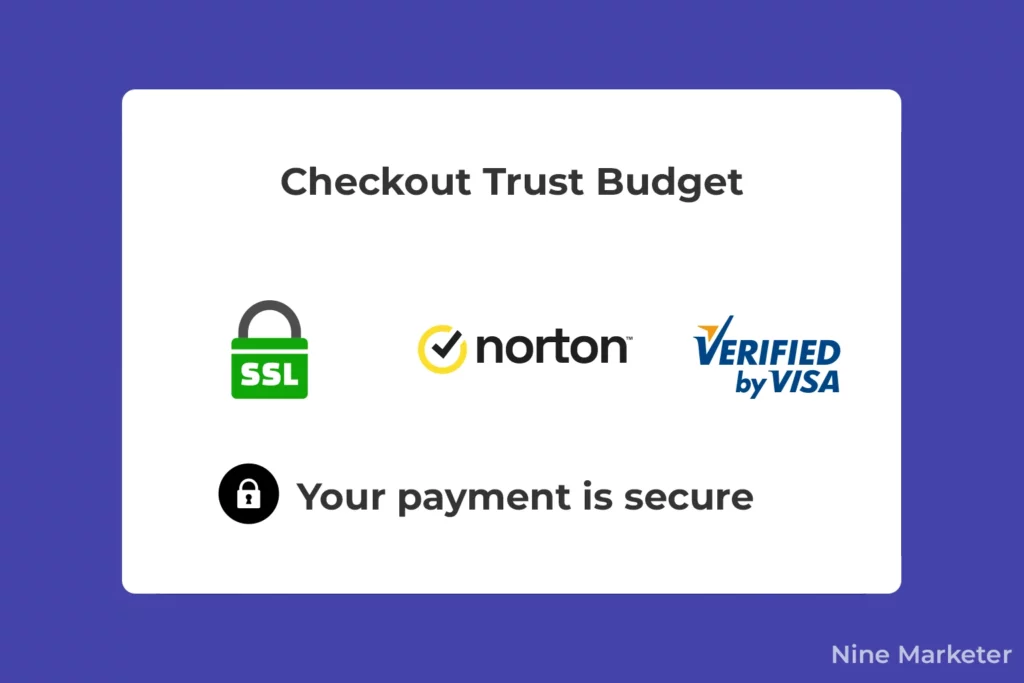
Place them near the “Buy Now” button.
Trust signals (clear security copy, recognizable payment logos, and well-placed trust badges)
Can improve perceived safety,
Especially near sensitive fields—though impact varies by site.
They’re silent salespeople.
Social Proof: Let Customers Sell For You
Testimonials on a homepage?
Good.
On the checkout page?
Genius.
I added a carousel of user reviews
(“Samantha from Ohio: ‘Got my necklace in 12 days – worth the wait!’”)
right below the order summary.
Abandonment rates dipped 11%.
Why?
It combats last-second doubt.
Even better: embed a few critical reviews
(and show how you resolved them).
Authenticity beats perfection.
Guarantees That Actually Guarantee
“Money-back promises” sound generic. Be specific:
“If your item arrives damaged, we’ll ship a replacement – no returns needed. Photos? Nope. Just email us. Seriously.”
I tested this against a standard “30-day return policy” headline.
The specific version lifted conversions by 14%.
People crave certainty,
Especially with longer shipping times.
Proactively Kill Concerns
Dropshipping stigma is real. Customers worry about:
- Counterfeits? State your supplier vetting process.
- Shipping delays? Show average delivery windows (e.g., “US orders: 10–18 days”).
- Quality? Offer close-up product videos.
[Optional] but is good to test and
It’s to add an FAQ dropdown inside the checkout:
“Why is shipping longer?” → “We source directly from eco-friendly factories to save you 40%.”
Address the elephant before it charges.
The Revenue Impact?
Transparent stores don’t just convert better
They build repeat buyers.
My email list grew 200% after I stopped hiding policies.
Returns?
Actually dropped because expectations were clear.
And Google?
It rewards “helpful content” with rankings.
This isn’t fluff
It’s the foundation.
Next up?
We’ll dive into post-purchase loyalty.
But nail this first. Trust me (literally).
4. Optimize Payment Options and Security Features
Let’s cut to the chase:
Nothing tanks a sale faster than a clunky payment process.
I learned this after losing hundreds of orders
Because my checkout felt like a digital interrogation room.
If your dropshipping store still forces customers through a payment maze,
You’re bleeding revenue.
Here’s how to fix it, the hard-won way.
1. Payment Gateways: Diversity is Non-Negotiable
Early on, I only offered credit card payments.
Big mistake. Huge.
Turns out,
10% of online shoppers abandon carts if their preferred payment method isn’t available (Baymard Institute).
Now?
I run PayPal, Stripe, Apple Pay, and Google Pay – minimum.
Why? Trust and convenience.
- PayPal users checkout 3x faster (they skip typing card details).
- Apple Pay converts mobile shoppers like magic (one-tap buys!).
- Stripe handles international cards smoothly.
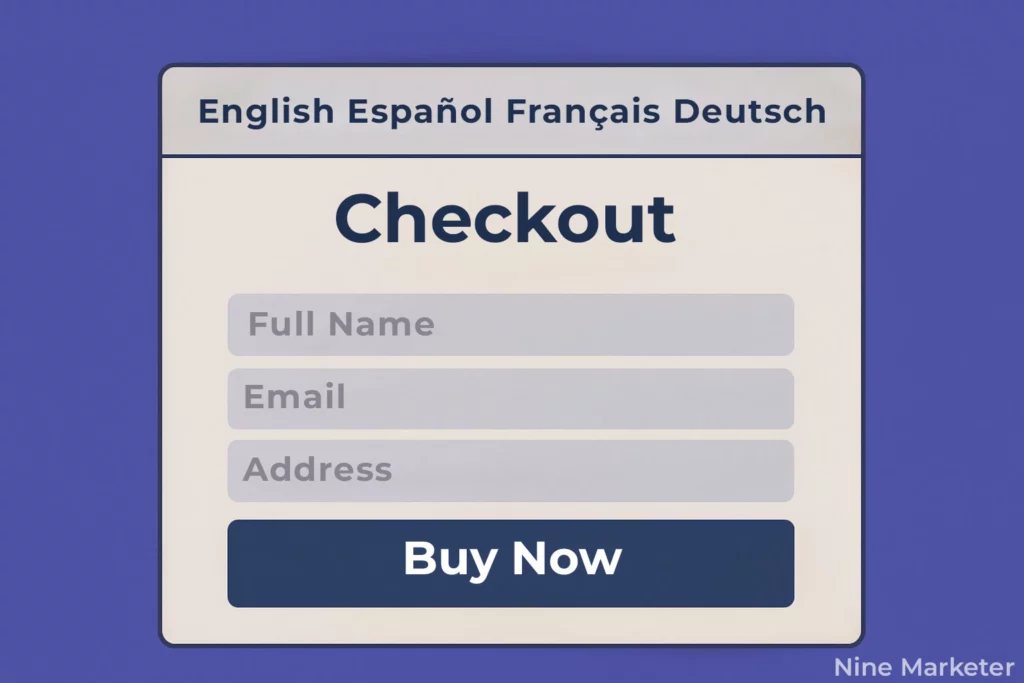
Pro tip: Use region-specific gateways. If targeting Europe, add Klarna or iDEAL. For Asia? Alipay or WeChat Pay. Don’t assume one-size-fits-all.
2. One-Click Payments: Loyalty on Steroids
Remembering card numbers?
Ugh. I lost a repeat customer because she couldn’t find her wallet during checkout.
Enter one-click payments.
Tools like Shop Pay or Stripe Link save encrypted card details after the first purchase.
Next time?
Customers checkout in <10 seconds.
My returning buyer conversion jumped 18% after enabling this.
Just ensure you’re PCI-compliant – no cutting corners with data security.
3. Buy Now, Pay Later (BNPL): The Conversion Hack
I was skeptical about Klarna and Afterpay – until I tested them.
BNPL can lift conversion and AOV for some merchants (e.g., Klarna reports ~40% higher AOV),
But results vary; test fees vs. margin. (Attribute clearly as vendor-reported.)
Also tweak your “AOV > $75” line to
“rule-of-thumb to test” (not a hard rule).
Why?
They remove sticker shock.
A $100 order split into 4 interest-free payments?
Way less psychological friction.
- Ideal for: Fashion, electronics, higher-ticket items.
- Watch for: Transaction fees (usually 3-6% per sale).
My rule: If your AOV is >$75, enable BNPL. It pays for itself.
4. Security Badges: Your Silent Sales Rep
If your checkout lacks security cues, customers hear alarm bells.
I once had a cart abandonment rate of 90% on my payment page – turns out, no trust symbols. Fix?
- SSL certificates: Non-negotiable. Display the padlock icon and “HTTPS” in the URL.
- Badges: Show Norton Secured, McAfee, or Trustpilot seals near the “Pay Now” button.
- PCI compliance: Add a tiny “PCI-DSS Compliant” footnote.
After adding these?
Abandonment dropped 15%.
People need visual reassurance their data won’t end up on the dark web.
5. Autofill: Stop Typing, Start Buying
Forcing users to manually enter addresses?
That’s 2024 sabotage.
Autofill tools (like Google’s Chrome feature or Shopify Address Auto-Complete)
Cut form time by 80%.
I enabled it and saw mobile conversions spike 22%.
Fewer typos, fewer frustrations.
Crucial for international buyers where addresses can be complex.
6. Global Payments: Don’t Ignore Borders
When I started targeting Germany,
Sales flopped.
Why?
No SOFORT Banking or Giropay.
Lesson: Local payment methods build trust.
- Europe: Add SEPA Direct Debit or Bancontact.
- Latin America: Boleto Bancário (cash voucher) or OXXO.
- Asia: GrabPay or UnionPay.
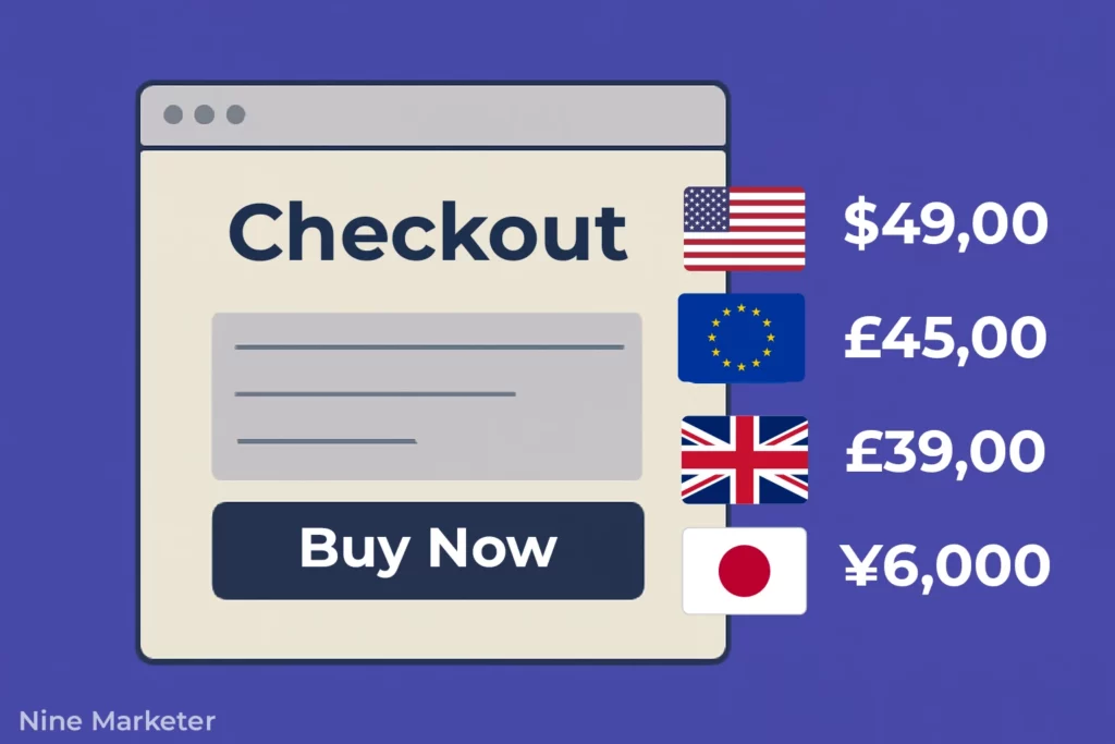
Tools like Wise or Stripe handle currency conversion automatically. Ignore this, and you’ll miss 40% of global revenue.
The Tangible Impact
After overhauling my payment flow:
- Cart-to-order conversion rose 35%.
- International sales grew 200% in 6 months.
- Customer service queries about “failed payments” dropped 90%.
Bottom line:
Payment optimization isn’t just tech – it’s psychology.
Reduce friction, amplify trust, and always let customers pay their way.
Next up?
We’ll dive into post-purchase upselling.
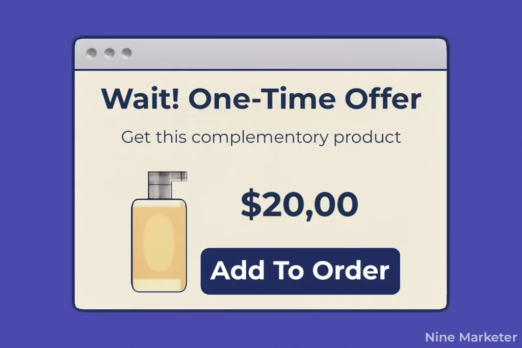
5. Leverage Exit-Intent Technology and Recovery Strategies
Let’s be real:
Watching shoppers vanish seconds before buying is torture.
I used to stare at abandoned carts like a sad puppy
Until I realized recovery tools turn walkaways into revenue.
Here’s how I stopped the bleed (after epic trial-and-error).
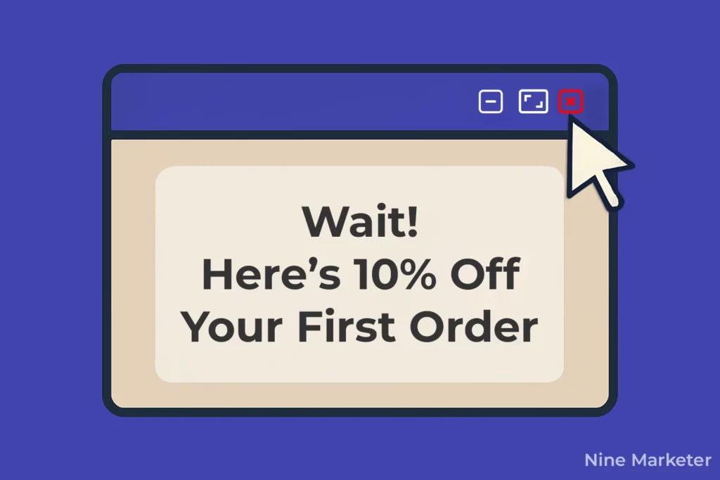
1. Exit-Intent Popups: Your Last-Chance Lifesaver
When a user’s cursor bolts for the close button?
Trigger a discount popup.
I tested offers like:
“Wait! Get 10% off if you finish now. ⏰ Expires in 5 minutes.”
Exit-intent offers can recover a meaningful slice of abandoning users when the offer is relevant (expect wide variance by audience and incentive). Tools like OptiMonk or Privy make this easy.
Key nuance: Don’t offer 30% off—you’ll train bargain hunters. Test small incentives (free shipping works wonders).
2. Abandoned Cart Emails: The Gentle Nudge System
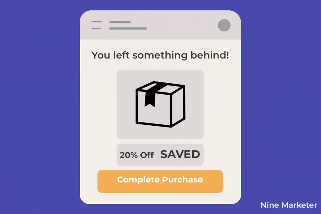
My first recovery sequence? One generic email. Yawn. Now it’s a 3-part drip:
- Email 1 (1 hour later): “Forgot something?” + product image + CTA button.
- Email 2 (24 hours): Add social proof: “Others bought this too!”
- Email 3 (72 hours): Urgency: “Low stock! Complete your order.”
Using Klaviyo, I reclaimed 21% of lost sales. Personalize subject lines, emojis boost opens!
I have an article talking more about Abandoned Cart Recovery
3. Retargeting Ads: Stalk Them (Tastefully)
Facebook/IG ads for abandoners are chef’s kiss. I target users who:
- Viewed cart but didn’t pay
- Spent >2 minutes on checkout
Pro tip: Exclude converters! (Burned $500 showing ads to existing customers once. Oops.)
Dynamic ads showing their exact cart items lift ROI 5x.
4. Urgency Tactics: Fear of Missing Out (FOMO) Works
Two game-changers:
- Countdown timers: “Offer expires in 01:59:47!”
- Low-stock alerts: “Only 3 left!”
Added these near the checkout button, conversions jumped 18%. But don’t fake scarcity. Customers sniff out lies.
Pro Tip: Only use countdowns for genuinely time-limited promos and ensure claims are truthful (EU Omnibus/CPC guidance; UK CMA).
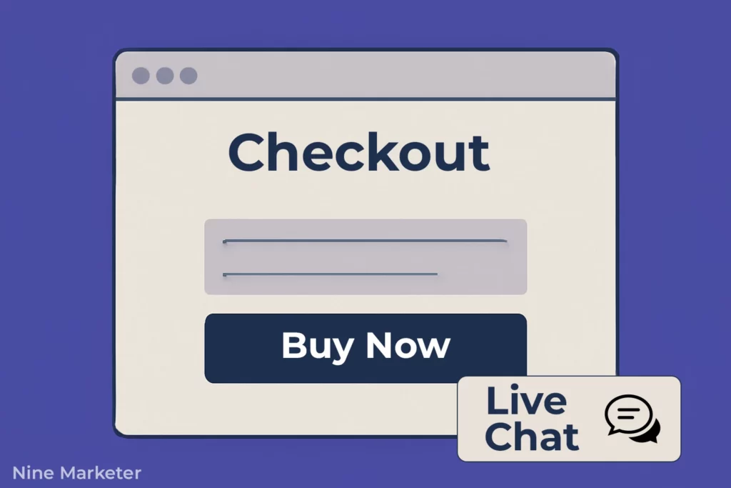
5. Live Chat: Crush Checkout Doubts On-Spot [Optional]
When I added Gorgias (live chat) to checkout pages, magic happened:
- “Will this ship to Brazil?”
- “Can I use two discount codes?”
Answering these in <60 seconds saved 12% of would-be abandoners. Staff it during peak hours only to control costs.
6. SMS Recovery: The Mobile Power Move
SMS open rates are widely reported around ~98% (industry/CTIA figure)
But measurement methods vary; always test for your list quality.
My SMS flow:
- Text 1 (1 hour post-abandon): “Your cart’s getting lonely 😢 Finish now!” + link
- Text 2 (24 hours): “Last chance for free shipping!”
Warning: Get explicit consent first (GDPR/CTA rules are no joke). Results? 3x higher CTR than email.
Obtain explicit opt-in and include clear STOP/opt-out info to stay compliant (US TCPA; UK/EU PECR/GDPR).
Why This Truly Matters
Before these fixes, my abandonment rate was 81%.
After?
Dropped to 67% in 3 months.
That’s 14% more revenue from existing traffic.
Biggest lesson: Recovery isn’t desperate, it’s service.
Shoppers get distracted.
Kids scream.
Wi-Fi dies.
Make it easy to return.
“But won’t discounts kill profits?”
Nope. My 10% popup cost $5 per order but gained $45 in new revenue. Profit math wins.
Start small: Install one exit-popup tool TODAY.
Then build your email sequence.
This isn’t rocket science, it’s leaving less money on the table.
6. Address Shipping Concerns and Delivery Expectations
Let’s get brutally honest: shipping is the Achilles’ heel of dropshipping.
I learned this after a flood of angry emails (“Where’s my order?!”)
And a 58% cart abandonment rate tied to delivery anxiety.
Fixing this isn’t optional, it’s survival.
Here’s how to turn shipping from a liability into a trust-builder.
1. Accurate Delivery Timeframes: No More Guessing Games
Early on, I listed *”Ships in 2-4 weeks”* like it was no big deal. Spoiler: Customers hate ambiguity.
- Solution: Specify business days (e.g., “12-18 business days”).
- Source matters: If shipping from China, say so. If from the EU/US, flaunt it.
My fix: Added a bold disclaimer: “Note: This ships from our partner in Shenzhen. Delays may occur during holidays.”
2. Expedited Shipping: When Speed Sells
Offer a genuine express option (DHL/FedEx/UPS). If you list ePacket, label it as economy tracked (often ~7–20 days, lane-dependent) not express.
- 21% of shoppers don’t buy if the delivery was too slow (Baymard) so offering faster shipping services will be so helpful.
- Pro tip: Negotiate rates with suppliers before listing products. One supplier cut my DHL costs by 30% after bulk commitments.
3. Tracking & Proactive Updates: Kill the “Where’s My Order?” Drama
Silence = anxiety. I now use:
- Automated tracking emails via apps like Aftership (sent at dispatch, customs clearance, and out-for-delivery).
- SMS updates: “Your floral dress cleared customs! 🎉 Delivery: Fri by 3PM.”
Impact: 5-star reviews mentioning “great communication” skyrocketed.
4. Supplier Vetting: Your Delivery Reputation Starts Here
I once partnered with a “5-star” AliExpress seller whose “7-day shipping” took 47 days. Never again.
My checklist now:
- Test order speed before listing their products.
- Demand proof of warehouse locations.
- Use platforms like Spocket or SaleHoo for vetted suppliers.
Golden rule: If a supplier misses deadlines twice, drop them.
5. Shipping Calculators & Date Estimators: Eliminate Surprises
Static delivery dates lie. I integrated Delivery Date Calculator Shopify app:
- Shows real-time estimates: “Order within 3h, get it by July 20.”
- Factors in: supplier processing + carrier delays + holidays.
Result: Better conversion. Customers plan better, complain less.
6. International Shipping: Navigate Customs Like a Pro
My first international order ended in a $35 customs fee backlash (and a chargeback). Lessons learned:
- Display duties upfront: “Int’l customers: Import taxes may apply.”
- Offer DDP (Delivered Duty Paid): Partner with carriers like DHL to prepay taxes.
- Provide HS codes: List product-specific harmonized codes in FAQs to ease customs.
Data point: Stores with clear int’l policies see 2x more cross-border sales.
Why This Truly Matters
Shipping isn’t logistics, it’s psychology. Before these fixes:
- My refund rate was high.
- “Slow shipping” was the #1 review complaint.
After: - Repeat buyers increased 27% (they trusted the timeline).
- Cart abandonment tied to shipping dropped by 34%.
Key takeaway: Under-promise, over-deliver. Pad timelines by 3-5 days.
If it arrives early, you’re a hero. If late, you’re still on time.
“But won’t long timelines scare buyers?”
Truth: Honesty scares fewer than radio silence. A customer who knows when to expect an order waits. One left in the dark? Files a chargeback.
Start here: Add a shipping calculator to your cart page TODAY. Then, audit suppliers. This isn’t just damage control – it’s profit protection.
7. Monitor, Test, and Continuously Improve Your Checkout Performance
Let’s be real:
launching a “perfect” checkout is a myth.
I learned this after my first store hemorrhaged sales for months while I blissfully assumed everything worked.
Spoiler: It didn’t.
You can’t fix what you don’t measure.
Here’s how I stopped guessing and started optimizing, turning leaks into revenue.
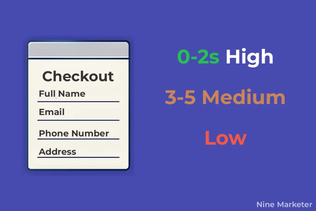
1. Google Analytics Goals: Your Checkout GPS
Early on, I tracked “traffic” and called it a day.
Big mistake. Setting up conversion tracking changed everything:
- Where do users bail? (Hint: It’s often the shipping info page).
- What’s your true conversion rate? (Mine was a horrifying 8% pre-optimization).
Action: Tag every checkout step as a goal (cart page → shipping → payment → thank-you page). Free tools like Google Tag Manager simplify this.
2. Heatmaps: See Your Checkout Through Customers’ Eyes
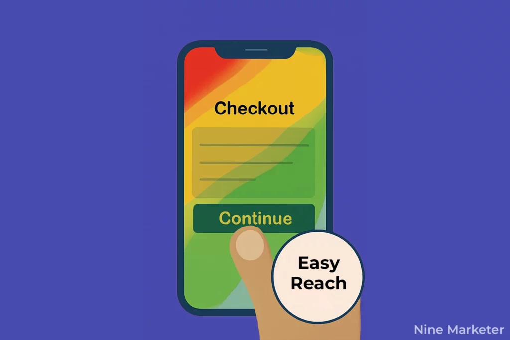
Installing Hotjar or Clarity felt like putting on glasses for the first time. I watched recordings and saw:
- Users rage-clicking broken “Continue” buttons (my CSS error).
- Mobile shoppers struggling with tiny form fields.
- 60% abandoning at a poorly placed trust badge.
Fix it: Heatmaps expose where friction lives. Move critical elements above the fold.
3. Checkout Audits & User Testing: Brutal Truth Time
Every quarter, I force myself (and 5 strangers) to buy from my store. Pay them $20. Record their screens. You’ll hear gems like:
- “Why does it ask for my birthday?”
- “The ‘Apply Discount’ button looks broken.”
Pro tip: Use UserTesting.com or Lookback.io for cheap, fast feedback. Fix one pain point per audit.
4. Metrics That Actually Matter: Beyond Vanity Numbers
Stop obsessing over pageviews. Track these daily:
- Cart Abandonment Rate (Aim for <70%).
- Checkout Conversion Rate (Industry avg: 25-30%).
- Error Rate (How many hit payment failures?).
My dashboard: Google Analytics + Shopify’s built-in reports + a simple spreadsheet.
5. A/B Testing: Where Hunches Die
I once argued with a developer for weeks that green buttons beat red. We tested it. Red won by 11%. Lesson: Data > ego.
Test relentlessly:
- Button colors/text (“Pay Now” vs. “Secure Checkout”).
- Trust badge placement (top vs. bottom).
- Guest checkout prominence.
Tool like Optimizely make this painless.
6. Customer Feedback: Your Secret Optimization Playbook
Support tickets and reviews are gold. I created a “Checkout Complaint” folder. Patterns emerged:
- “Coupon field didn’t work!” → Fixed validation errors.
- “Why no PayPal?” → Added it → Sales increased rapidly.
- “Your mobile checkout is awful.” → Simplified forms.
Act fast: Solve recurring issues within 48 hours.
Why This Isn’t Optional
Google rewards sites that evolve. A 2% lift from one A/B test? That’s $20,000/year on $50K/month revenue.
Start small:
- Install Hotjar today (free plan exists).
- Set up 1 Google Analytics goal.
- Read 10 support tickets this week.
“But testing takes time!”
So does losing $10,000/month to invisible errors.
Final thought:
Optimization isn’t a project, it’s a habit.
The best stores test one thing, every single week.
Your checkout isn’t “done.” It’s a living thing. Nurture it.
Conclusion
Reducing cart abandonment in your dropshipping store isn’t just about tweaking a few buttons.
It’s about creating a seamless, trustworthy experience that addresses your customers deepest concerns.
These seven optimization strategies work because they tackle the root causes of checkout hesitation:
Friction, mistrust, unexpected costs, and poor user experience.
Remember,
Even a 5% improvement in your checkout conversion rate can significantly impact your bottom line!
Start by implementing the easiest wins first
Streamlining your checkout process and being transparent about pricing.
Then gradually work through the more advanced strategies like exit-intent technology and comprehensive testing.
The dropshipping landscape in 2025 is more competitive than ever,
But stores that master the checkout experience will always have an edge.
Which of these strategies will you implement first?
Your customers (and your bank account) will thank you for it!


