Did you know that 85% of shoppers cite color as the primary reason they purchase a particular product?
I’ve seen firsthand how the right color palette can transform a struggling dropshipping store into a conversion powerhouse overnight!
Color isn’t just about aesthetics
it’s a powerful psychological trigger that influences buying decisions, builds brand recognition, and creates emotional connections with your customers.
When you’re running a dropshipping business, where competition is fierce and trust needs to be established quickly, understanding color psychology becomes your secret weapon.
The colors you choose for your store design can mean the difference between a visitor bouncing within seconds or staying to make a purchase.
In this comprehensive guide,
I’ll walk you through everything you need to know about leveraging color psychology to create a dropshipping store that not only looks stunning but converts like crazy!
1. The Science Behind Color Psychology in E-commerce
You ever notice how some online stores just feel right the second you land on them?
That’s not an accident.
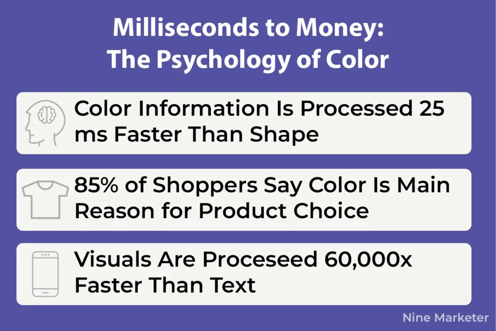
Your brain is processing color information a full 25 milliseconds faster than it processes shapes, according to research from the Max Planck Institute.
That might not sound like much, but in the digital world, those milliseconds matter more than you’d think.
Here’s the wild part 85% of shoppers say color is the primary reason they choose one product over another.
Not the features.
Not the price.
The color.
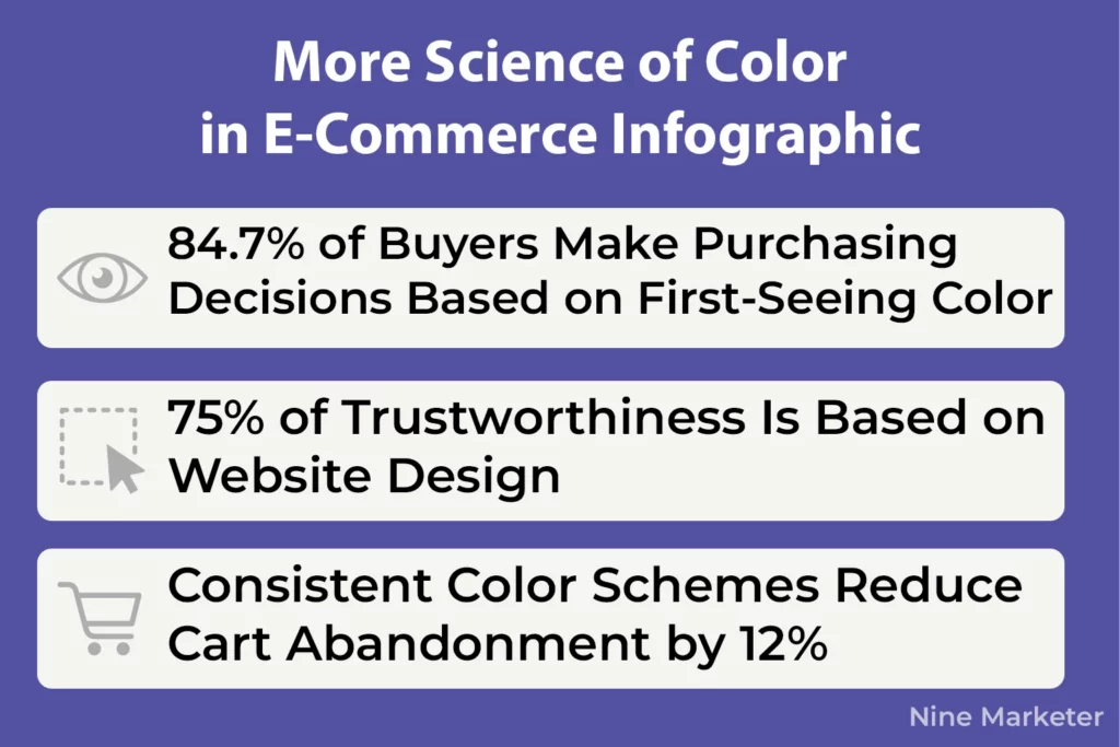
And get this: 84.7% of buyers are making their entire purchasing decision based on what color they see first.
When you realize our brains process visual content 60,000 times faster than text,
Suddenly those color choices on your product pages become a lot more important than that carefully crafted description nobody’s reading.
But why does color hit us so hard online compared to shopping at a physical store?
Simple
You’ve got zero other sensory information to work with.
Can’t touch the fabric.
Can’t smell the leather.
Can’t hear how solid that gadget sounds when you click it.
Color becomes the emotional anchor,
And studies show that anywhere from 62% to 90% of first impressions online are based purely on color That’s a massive range,
Yeah, but even at the low end,
You’re looking at the majority of judgments being made before someone even reads your headline.
The trust factor kicks in fast too.
A Stanford study found that 75% of people are evaluating your business’s trustworthiness based on your website design
And color is a huge chunk of that equation.
E-commerce platforms that maintain consistent color schemes across their site see cart abandonment drop by 12%.
Consistency breeds trust, and trust breeds sales.
Now here’s where things get tricky.
Cultural differences can totally wreck your conversion rates if you’re not paying attention.
In some countries, white represents purity and weddings.
In others, it’s the color of mourning.
Purple might scream luxury to shoppers in Europe and North America, but it can mean something completely different elsewhere.
If you’re selling globally,
You better know your audience’s color associations or you’re gonna lose them before they even scroll.
Recent 2025 data shows that adaptive color systems
Ones that change based on user preferences and time of day, are seeing an 18% improvement in task completion. And brutalist, trendy color schemes?
They’re actually tanking conversion rates by 22% compared to more traditional approaches.
Turns out what looks cool in a design portfolio doesn’t always translate to sales.
The bottom line is this: color isn’t decoration in e-commerce.
It’s a conversion tool that’s been proven to work in milliseconds.
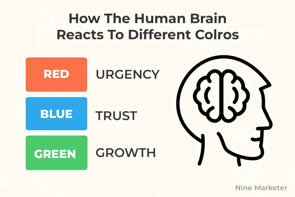
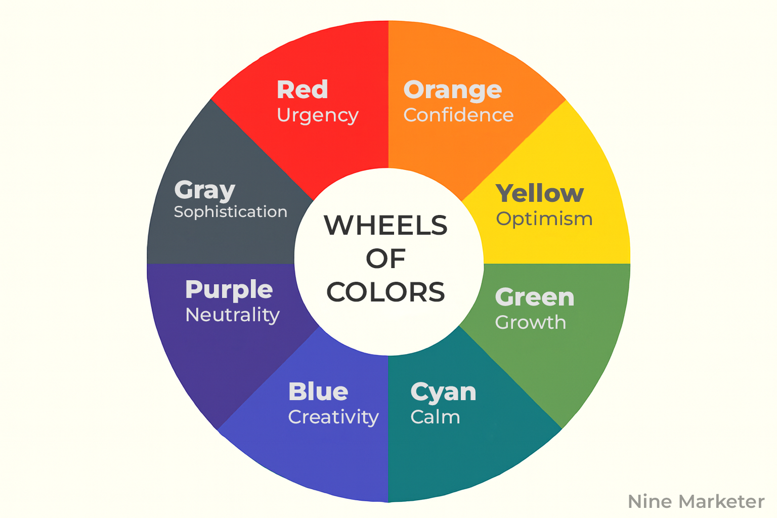
2. Red: The Urgency and Excitement Driver
There’s something about red that just hits different when you’re scrolling through an online store.
Your brain actually processes it as a signal to pay attention right now.
It’s primal, really.
Which is probably why every clearance sale banner you’ve ever seen was screaming at you in red.
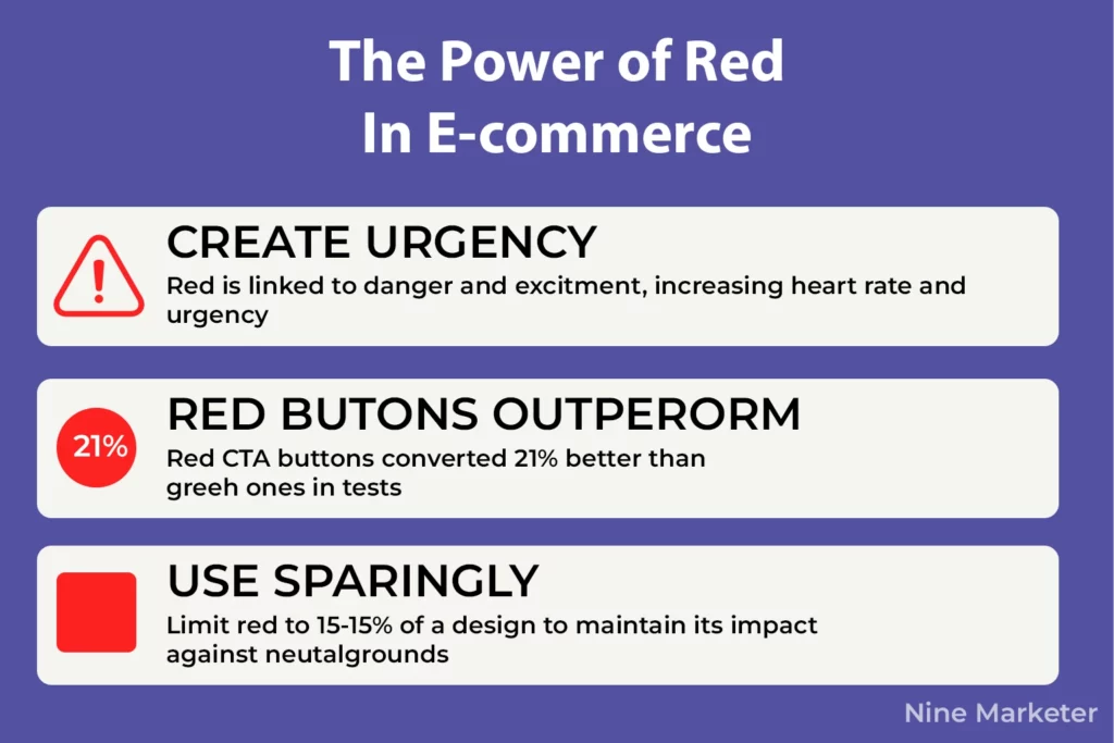
Here’s what’s interesting red call-to-action buttons outperformed green ones by 21% in HubSpot’s testing.
Twenty-one percent!
And in another test with 600 people, switching from a black button to red increased conversions by a whopping 34%.
That’s not a small bump
That’s the difference between a mediocre month and a killer one for dropshipping stores.
But you gotta understand why red works before you plaster it everywhere.
Red creates urgency because it’s associated with danger and excitement.
When someone sees red, their heart rate literally increases slightly.
That physical response translates to faster decision-making, which is exactly what you want for impulse purchases.
Data shows red and orange buttons generate 32-40% higher click rates compared to other colors.
That’s massive for conversion rates.
For dropshipping stores, red works best on specific elements
Not everything.
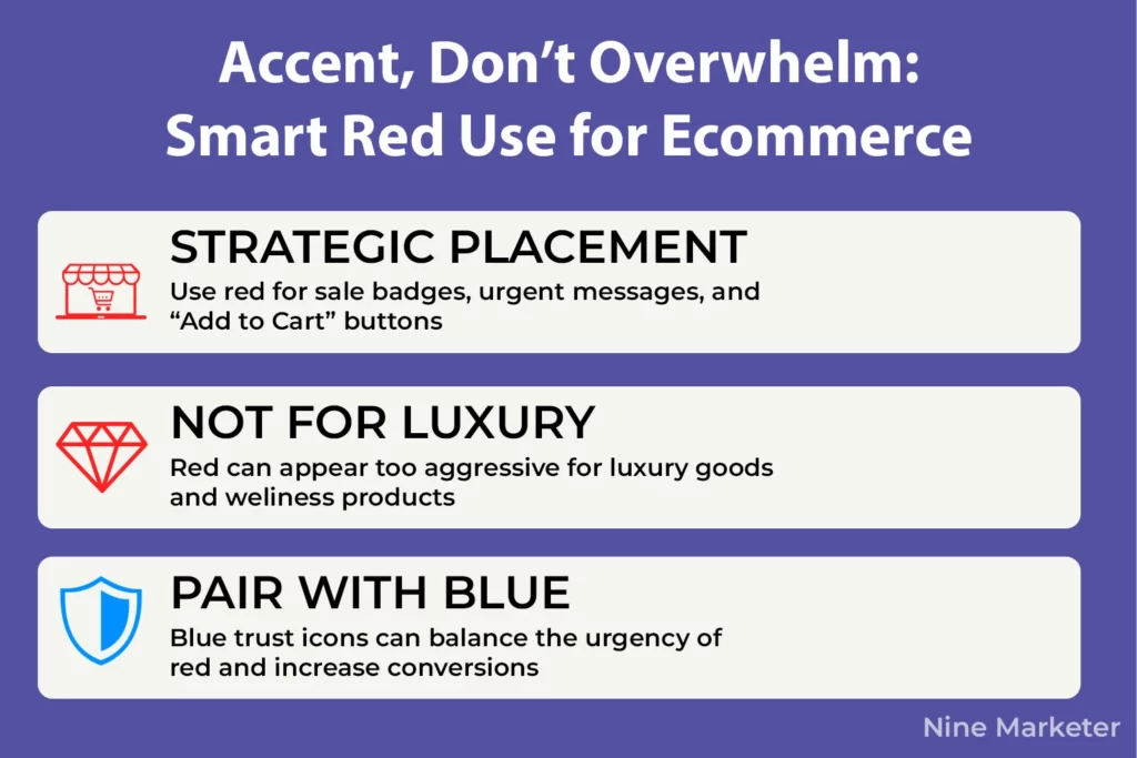
Slap it on your “Limited Time Offer” badges, your countdown timers, your “Add to Cart” buttons during flash sales.
Verizon Wireless does this perfectly with their red CTAs.
Amazon uses orange (which is red’s friendlier cousin) for their urgency messaging.
Both work because they’re strategic about placement.
Fashion dropshipping stores benefit huge from red accents.
So do electronics, clearance items, and anything targeting impulse buyers.
But here’s the thing
If you’re selling luxury goods or wellness products, red might backfire.
Too aggressive.
Context matters more than most people realize.
Now,
Overwhelming visitors with red is where folks mess up.
If your entire site is red, nothing stands out.
The urgency loses its punch.
Keep red to maybe 10-15% of your design
Use it as an accent color against neutral backgrounds like white, light gray, or even black.
Red and white is classic for a reason.
Red with black screams premium urgency (think high-end fashion sales).
Red with gray feels modern and clean.
One store owner shared that combining red CTAs with blue trust elements (like security badges near checkout) increased their completion rate significantly.
The red drove action, the blue calmed fears.
Smart combo.
The mistake people make is using red for everything clickable.
Don’t.
Use it strategically where you genuinely want to create urgency
Sale items, limited stock warnings, checkout buttons during promotions.
For regular browsing and product pages, softer colors work better.
Save red for when you really need someone to act fast, and it’ll work like crazy.
3. Blue: Building Trust and Credibility
If there’s one color that dominates the e-commerce world, it’s blue.
And there’s a damn good reason for that.
Blue is the most universally liked color across the planet, and when it comes to getting strangers to trust you enough to hand over their credit card info, trust is everything.
Healthcare websites achieve 18% higher trust ratings when they use blues and greens.
That’s huge when you’re a new brand trying to convince someone you’re legit.
PayPal didn’t pick blue by accident,
Neither did Facebook, IBM, or basically every bank you’ve ever dealt with.
They understand something fundamental: blue reduces perceived risk in ways other colors simply can’t match.
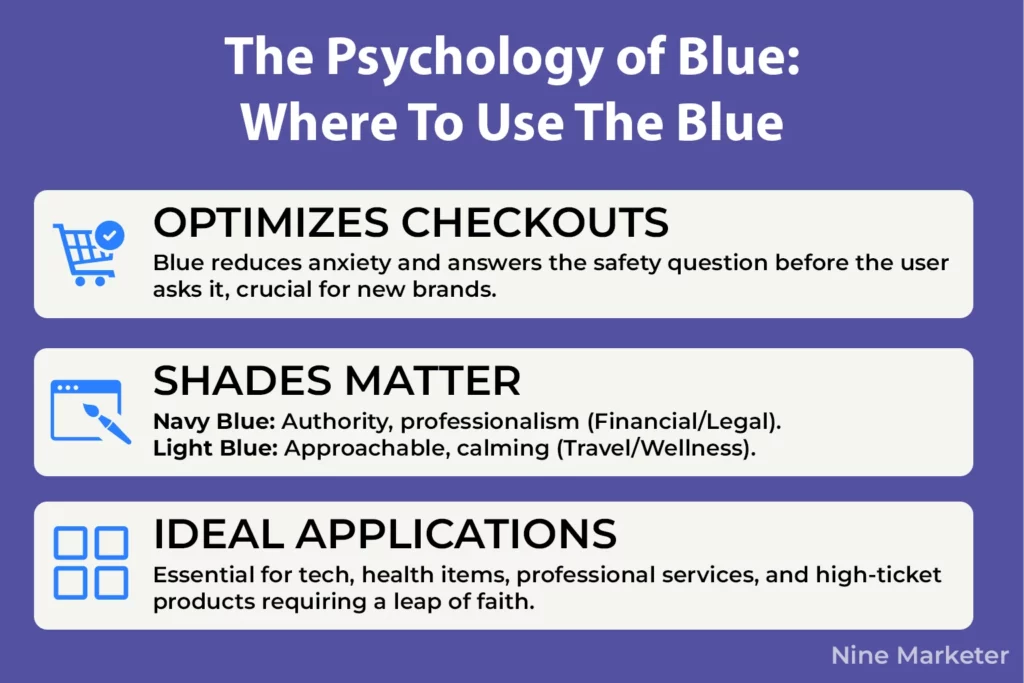
Here’s what makes blue so powerful for checkout pages specifically.
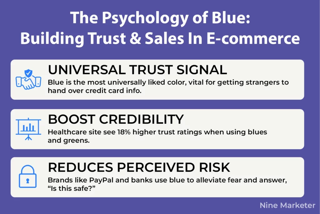
When someone’s about to spend money with a brand they’ve never heard of before, their brain is screaming “Is this safe?”
Blue answers that question before they even realize they’re asking it.
One fintech company reported higher click-through rates after switching their call-to-action buttons to blue, which makes total sense when you understand that blue aligns with trustworthiness.
But not all blues are created equal, and this is where folks mess up.
Navy blue communicates authority, professionalism, and traditional reliability
Perfect for financial services or legal tech products.
It’s serious.
Light blue, on the other hand, feels more approachable and calming.
Think travel sites or wellness products.
Tech products benefit massively from blue.
So do health items, professional services, basically anything where the buyer needs reassurance.
If you’re selling something that requires a leap of faith
Supplements, software subscriptions, high-ticket items
Blue should be somewhere in your color palette.
The data backs this up hard.
Now here’s the catch with blue: it can feel cold if you’re not careful.
Ever land on a site that’s all navy and gray and immediately feel like you’re in a boring corporate PowerPoint?
That’s what happens when you don’t warm it up.
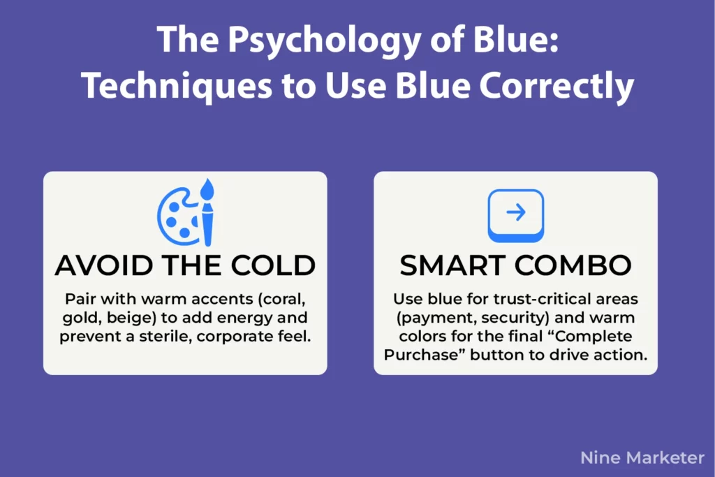
The trick is pairing blue with complementary colors that add some life.
Blue with coral or warm orange creates energy while maintaining trust.
Blue with gold looks premium and luxurious.
Blue with sandy beige or warm gray softens the corporate feel without losing credibility.
For checkout pages, keeping blue as your primary color while adding warm accent colors for your “Complete Purchase” button can actually improve conversion rates.
The blue builds trust throughout the journey, then the warm accent creates that final push to act.
Smart combo that plays on two different psychological triggers.
The biggest mistake people make?
Using too much blue everywhere and creating a sterile, boring experience.
Blue should dominate trust-critical areas
Payment sections, security badges, guarantees
But balance it out with warmer tones in your product photography and marketing copy sections.
You want people to trust you, not fall asleep.
4. Green: Wealth, Growth, and Eco-Friendly Appeal
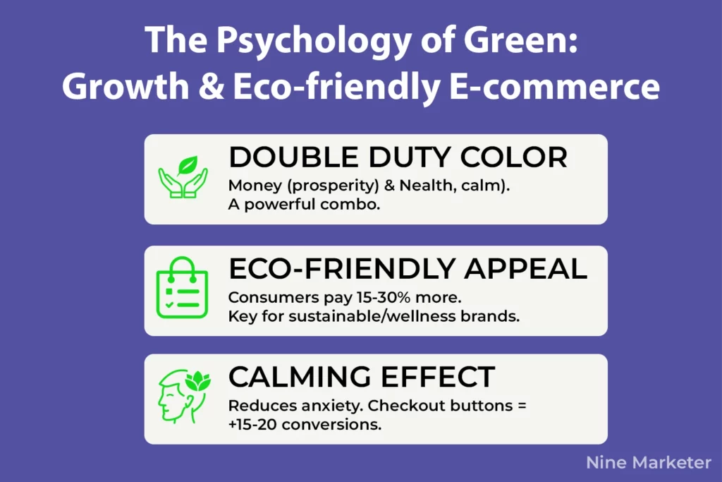
Green is basically doing double duty in e-commerce, and most store owners don’t realize how powerful that is.
On one hand, it’s money
Literal dollar bills
So your brain automatically associates it with prosperity and financial success.
On the other hand, it’s nature, health, and that calming vibe that makes people feel good about buying stuff.
That’s a killer combo when you know how to use it right.
Here’s something wild: consumers will pay 15-30% more for products they perceive as eco-friendly, and green packaging is a huge part of that perception.
Whole Foods didn’t accidentally make their entire brand green.
They understood that green creates this instant association with natural, organic, and trustworthy products.
If you’re dropshipping anything eco-friendly, sustainable, or remotely connected to wellness, green needs to be in your toolkit.
The calming effect of green is no joke either.
One store owner switched their checkout button from red to green and saw their conversion rates jump 15-20%.
Why?
Because green feels less pushy.
Red was making people anxious during checkout
That fight-or-flight urgency response.
Green said “relax, you’re making a good choice here.”
For health supplements, organic skincare, yoga gear, anything in the wellness space, green outperforms aggressive colors every single time.
But green’s effectiveness goes way beyond just eco-products.
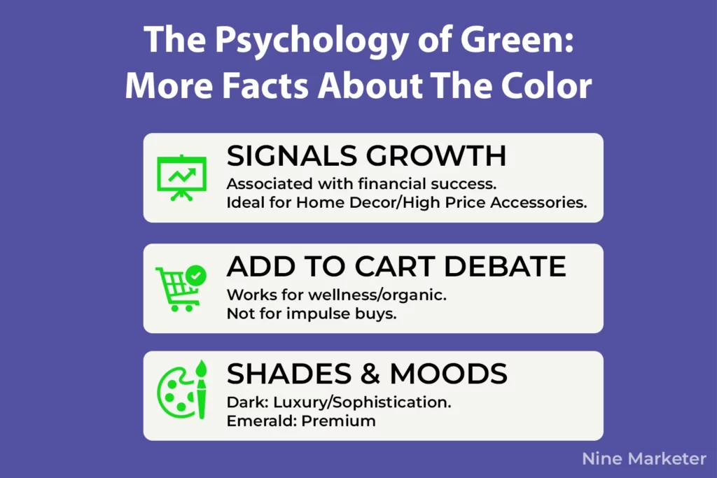
Financial services and investment platforms love green because it signals growth and prosperity.
Think about it
Stock charts go green when they’re up, right?
Your brain has been trained to associate green with positive financial movement.
That’s why fintech apps and banking platforms use green so heavily.
It creates this subconscious feeling of abundance and possibility that makes people more comfortable spending or investing money.
Now, the “Add to Cart” button debate.
Does green work?
Honestly, it depends on your niche.
For wellness products, organic goods, and anything eco-related, green buttons perform incredibly well because they reinforce the product’s message.
For impulse-buy items or flash sales, red or orange might still win.
But for products where people need reassurance and calm during the buying process, green is your friend.
The versatility of green is where people get creative.
Light green feels fresh, youthful, and approachable
Perfect for organic snacks or natural beauty products.
Darker forest green communicates luxury and sophistication.
Emerald green can make products look premium while still maintaining that natural vibe.
One dropshipper told me they used sage green throughout their sustainable home goods store and saw engagement rates climb because it felt modern and calming at the same time.
Color combinations matter too.
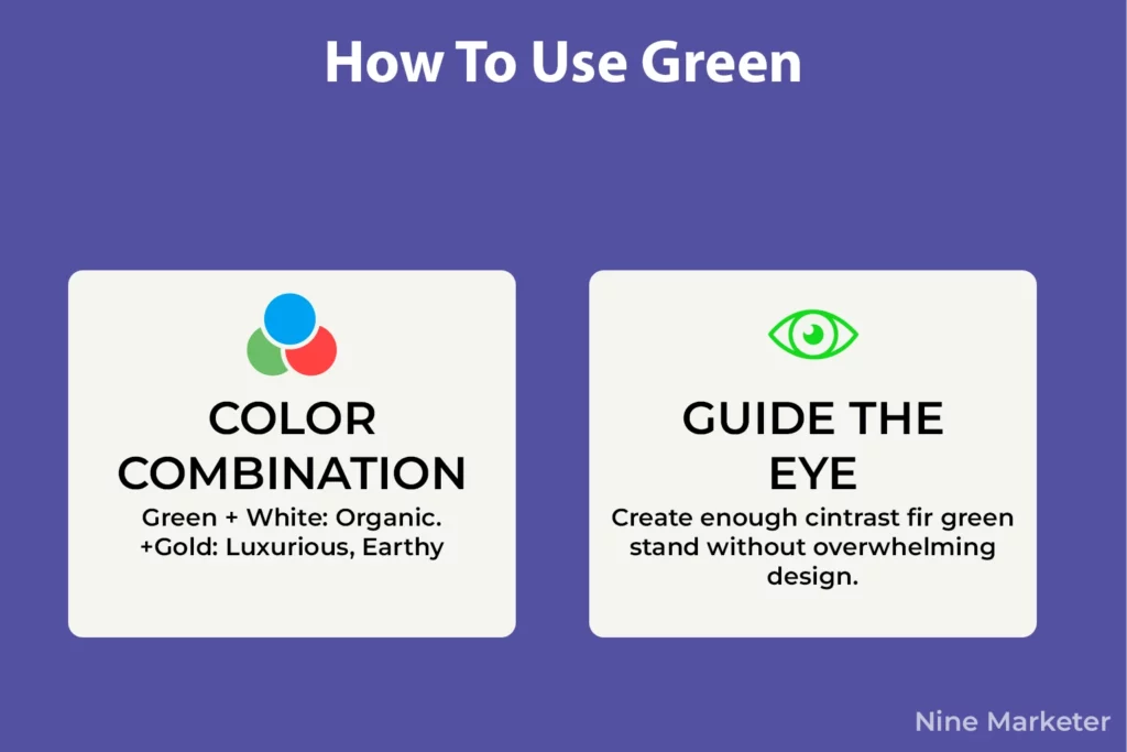
Green with white creates that clean, organic aesthetic everybody loves.
Green with gold looks luxurious and premium.
Green with warm browns feels earthy and authentic.
If you’re going for that trendy minimalist vibe, pair green with beige or cream.
The trick is making sure your green accents don’t get lost
They need enough contrast to guide the eye toward action without overwhelming the design.
5. Yellow and Orange: Energy, Optimism, and Call-to-Action Power
Orange buttons aren’t just popular
They’re proven performers.
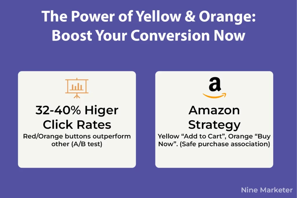
Data from over 1.2 million A/B tests shows that red and orange buttons generate 32-40% higher click rates compared to other colors.
That’s not a subtle difference.
That’s the kind of boost that can transform a struggling dropshipping store into a profitable one.
But here’s what makes orange and yellow so interesting
They work on a completely different psychological level than red or blue.
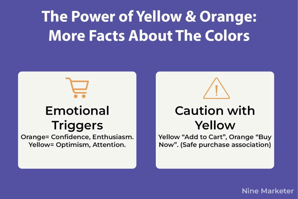
Orange radiates confidence and enthusiasm without feeling aggressive.
It’s warm, it’s friendly, and it creates this sense of
“hey, clicking this is gonna be a good decision.”
Amazon didn’t accidentally choose orange for their buttons.
They’ve tested the hell out of every element on their site, and orange keeps winning because it connects happiness with purchasing behavior.
Yellow grabs attention faster than almost any color.
It’s bright, optimistic, and impossible to ignore against most backgrounds.
The thing is, yellow walks a fine line.
It’s associated with optimism and cheerfulness, but also with caution and warning.
Think about it
Police tape, road signs, hazard warnings.
Your brain is hardwired to pay attention to yellow, which makes it powerful for CTAs, but you gotta use it carefully or it backfires.
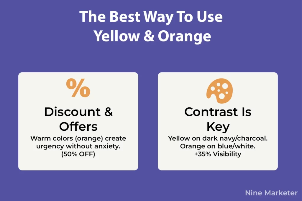
For discount badges and limited-time offers, warm colors are your best friends.
That “50% OFF” banner in bright orange?
It’s creating urgency without the anxiety that red can trigger.
One store reported their conversions increased when they switched their sale badges from red to orange
Customers felt excited rather than pressured.
That’s the sweet spot you’re looking for.
Now let’s talk about Amazon’s strategy because it’s brilliant.
Their entire site incorporates yellow and orange throughout.
The “Add to Cart” button is yellow, the “Buy Now” is orange.
They’ve conditioned millions of shoppers to associate those colors with smooth, happy purchasing experiences.
When someone sees an orange or yellow button now, there’s this subconscious trigger that says “I know what happens when I click this, and it’s safe.”
But orange and yellow can absolutely tank your conversions if you’re not strategic.
Yellow can feel overwhelming or hard to read against certain backgrounds.
If your button’s too bright, it can connote warning or anxiety instead of cheerfulness.
One dropshipper told me they tested a neon yellow CTA and their bounce rate spiked
People felt assaulted by the brightness.
Dialing it back to a softer, warmer yellow fixed everything.
Contrast is everything with these colors.
A yellow button on a white background?
Terrible.
Can barely see it.
Yellow on a dark navy or charcoal background?
Chef’s kiss.
Orange pops beautifully against blue or white.
The key is making sure your warm-colored CTAs stand out without screaming.
High-contrast buttons can improve conversions by over 35% just from visibility alone.
The biggest mistake people make is slapping orange or yellow everywhere and hoping for magic.
These colors work best when they’re used strategically, for action buttons, special offers, discount tags.
Keep the rest of your design more neutral so those pops of warm color guide the eye exactly where you want it.
Too much yellow and orange just creates visual chaos, and nobody clicks anything when they’re overwhelmed.
6. Black and White: Sophistication, Minimalism, and Luxury Branding
Walk into any high-end store and you’ll notice something
They’re not afraid of empty space.
That’s no accident.
Black and white color schemes don’t just look clean, they fundamentally change how people perceive value.
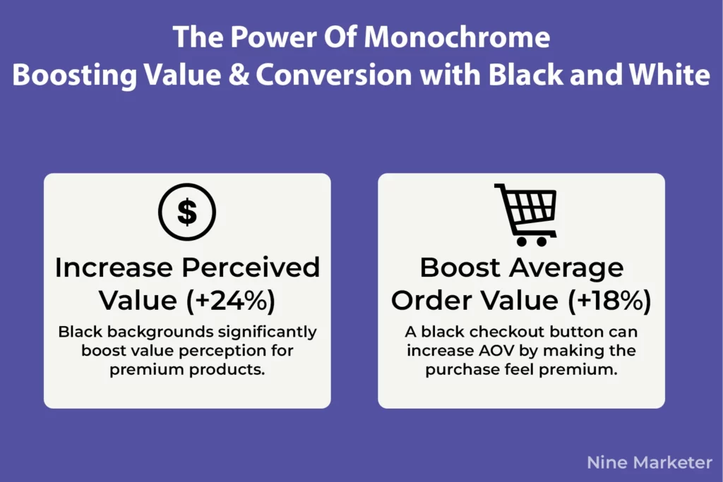
Studies show that black backgrounds increased perceived value by 24% for premium products.
That’s a massive psychological shift just from changing a background color.
Here’s why luxury dropshipping stores obsess over black and white palettes.
Black communicates power, exclusivity, and premium quality without saying a word.
When someone lands on a site with strategic black elements, their brain immediately associates it with high-end products.
One coffee seller switched his checkout button to black and saw his average order value jump 18%.
People literally felt more comfortable buying expensive items because the black button made the whole experience feel premium.
But black alone can feel intimidating or cold, which is where white space comes in.
And we’re not just talking about making things look pretty
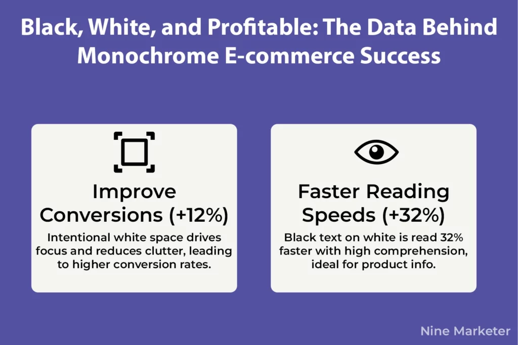
White space directly impacts your bottom line. A/B testing designs with proper white space can improve conversions by 12%.
That’s because emptiness drives focus.
When you strip away clutter and give key elements room to breathe, people’s brains process information faster and make decisions easier.
The psychology here is fascinating.
Google’s testing revealed that black text on white backgrounds leads to 32% faster reading speeds while maintaining near-perfect comprehension.
Your customers are literally absorbing information quicker and understanding it better with this simple combination.
For product descriptions, checkout pages, and pricing info, that speed matters.
Monochrome designs absolutely dominate fashion, jewelry, and luxury goods dropshipping.
Think about brands like Chanel, Apple, or any high-end watch company
They lean hard into black and white because it signals sophistication and timelessness.
The lack of color distractions forces attention onto the product itself, making each item feel more important and valuable.
But here’s the trap people fall into: creating designs that feel sterile and cold.
All black and white with no warmth can make your store feel like a boring corporate website.
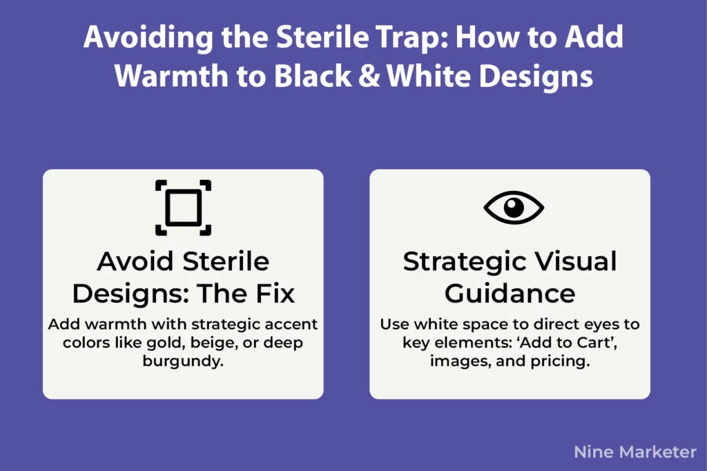
The fix? Strategic accent colors.
Black and white with gold accents screams luxury.
Add warm beige or cream tones and suddenly the minimalism feels approachable instead of intimidating.
Even a subtle pop of color on your CTA buttons
Like a rich burgundy or forest green
Can add personality while maintaining that premium vibe.
The key is balance.
Use white space intentionally to guide eyes toward important elements, your “Add to Cart” button, your product images, your pricing.
Don’t fill every inch with content just because it’s empty.
That emptiness is doing work for you, creating breathing room that makes your store feel curated and intentional rather than desperate to sell.
7. Purple: Creativity, Royalty, and Premium Positioning
Purple is weird in the best possible way.
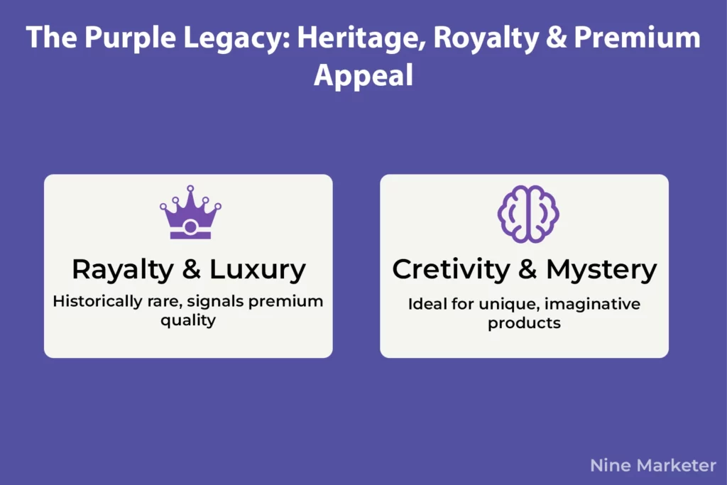
It’s simultaneously the color of royalty and creativity, luxury and mystery.
That’s because historically, purple dye was so rare and expensive that only royalty could afford it.
Your brain still carries that association today, which makes purple a powerful tool for premium positioning in e-commerce.
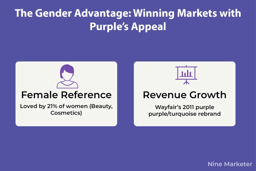
Here’s something interesting about purple’s appeal, women prefer purple at 27%, making it one of their top color choices after blue.
That’s huge for beauty, cosmetics, and creative product stores.
Wayfair figured this out and switched to a purple and turquoise palette in 2011, which contributed to their exponential revenue growth over the following years.
Purple resonates with female audiences in ways that other colors simply don’t.
But purple walks this fine line between luxury and dated.
Use it wrong, and your store looks like it’s stuck in the ’90s.
Use it right, and you’ve got premium positioning without the coldness of black or the aggression of red.
The trick is understanding which shade of purple you’re working with.
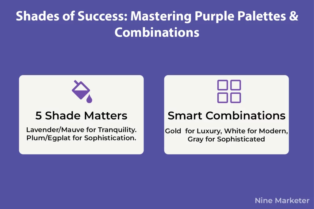
Lighter purples like lavender and mauve create feelings of tranquility, femininity, and luxury.
They’re perfect for skincare, wellness products, and anything targeting a feminine audience.
Tatcha uses purple throughout their packaging to convey luxury while maintaining that calming, spa-like vibe.
It works because lighter purples feel approachable while still signaling premium quality.
You can also check this article that spoke about the color psychology in beauty product
Let’s continue
Deeper purples
Royal purple, plum, eggplant, communicate exclusivity, sophistication, and creativity.
These shades are favored by high-end brands because they create that sense of timelessness and prestige.
Think about it
Cadbury owns their specific shade of purple. So does Hallmark. These brands understand that deeper purples create an immediate association with quality and imagination.
Purple absolutely dominates in mystery and imagination-driven products.
Anything creative, spiritual, or unique benefits from purple accents.
Fantasy products, tarot decks, creative software, artistic supplies, purple tells customers “this is different, this is special.”
The challenge with purple is avoiding that dated or overly niche look.
Too much purple, especially the wrong shade, can make your store feel like it’s targeting a very specific audience that might not include everyone.
The fix is strategic use and smart combinations.
Purple with gold screams luxury.
Purple with white feels modern and clean.
Purple with gray creates a sophisticated, contemporary look that doesn’t feel stuck in any particular era.
What’s fascinating is that purple lands in both the favorite and least favorite categories for colors, but significantly more women prefer purple color than dislike it.
That makes it polarizing but powerful when used for the right audience.
If your target demographic is women interested in beauty, wellness, or creative products, purple should absolutely be in your color strategy.
8. Pink: Femininity, Romance, and Playfulness
Pink has come a long way from being pigeonholed as “just a girl’s color.”
Modern e-commerce has figured out that pink is way more versatile than most people give it credit for.
The truth is, pink creates an immediate emotional connection that few colors can match
And that connection translates into sales when you use it right.
Here’s what’s fascinating: pink color is actually more often preferred by women, but not in the stereotypical way most brands assume.
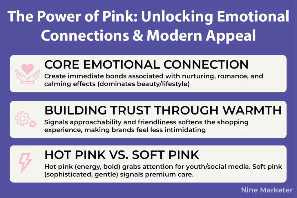
It’s primarily associated with nurturing, romance, and creating a calming effect on customers, which is exactly why it dominates beauty and lifestyle products.
Glossier literally trademarked their specific shade of millennial pink to protect their branding
That’s how valuable the right pink can be.
The hot pink versus soft pink debate is real and it matters for your conversions.
Hot pink radiates energy, youth, and boldness.
It grabs attention immediately and works brilliantly for fashion brands targeting younger audiences or products that need to pop on social media feeds.
But soft pink
Especially millennial pink, which became iconic in the 2010s
Communicates sophistication, approachability, and modern femininity without being overpowering.
One dropshipper told me they tested both shades for their skincare line,
And soft pink outperformed hot pink by a significant margin because customers associated it with gentle, premium care rather than aggressive marketing.
Pink’s superpower is creating approachable, friendly brand personalities.
When brands use pink strategically, they’re signaling “we’re not intimidating, we get you, come hang out with us.”
That’s why so many DTC beauty brands lean heavily on pink palettes
They’re building trust through warmth rather than authority.
The color literally softens the entire shopping experience and makes people feel more comfortable buying from brands they’ve never heard of before.
Now, millennial pink became emblematic in the 2010s, symbolizing lightness, optimism, and a challenge to traditional gender codes.
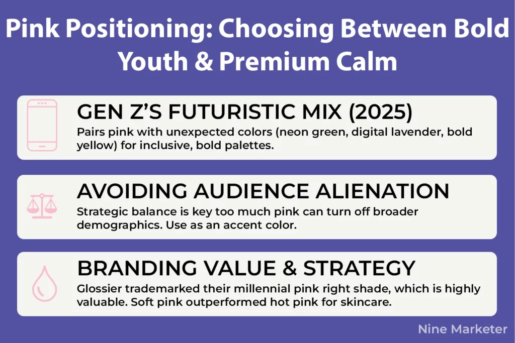
But in 2025, Gen Z is mixing things up.
They still appreciate pink, but they’re pairing it with unexpected colors
neon greens, digital lavender, and bold yellows
Creating this futuristic, inclusive vibe that breaks pink out of its old-school associations.
Brands targeting Gen Z need to understand that pink works best when it’s part of a broader, bolder palette rather than being the star of the show.
The challenge with pink is avoiding audience alienation.
Too much pink, especially in certain shades, can make your store feel exclusively feminine in ways that might turn off broader demographics.
The fix is strategic balance.
Use pink as an accent color paired with neutrals like gray, white, or beige.
Pink with black creates this high-contrast, modern luxury vibe.
Pink with gold feels premium and indulgent.
Pink with navy blue softens corporate vibes while maintaining professionalism.
The biggest mistake people make is assuming all pink is created equal.
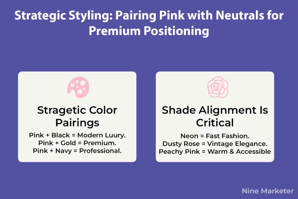
A neon hot pink screams fast fashion and youth culture.
A dusty rose communicates vintage elegance.
A peachy pink feels warm and accessible.
Understanding which shade of pink aligns with your brand message is absolutely critical
Get it wrong and you’ll either look dated or completely miss your target audience.
9. Color Combinations That Convert: Proven Palettes for Dropshipping
You’ve picked your individual colors, but here’s where things get tricky
How do you actually put them together without creating a visual disaster?
That’s where the 60-30-10 rule saves your butt every single time.
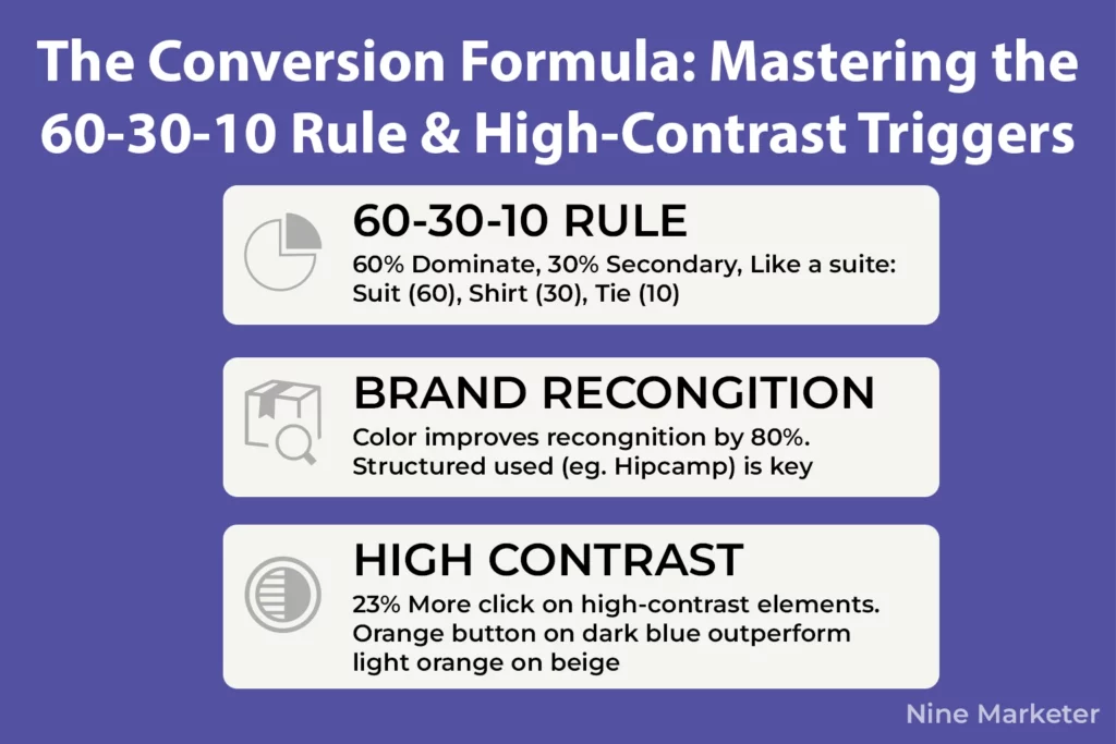
The breakdown’s simple: 60% dominant color, 30% secondary, and 10% accent.
Think of it like a business suit
The suit itself is 60%, the shirt is 30%, and that pop of color from the tie is your 10%.
This isn’t just some arbitrary designer preference either.
Research shows color can improve brand recognition by up to 80%, and structured color distribution is a huge part of that recognition.
When Hipcamp applied the 60-30-10 rule with their nature-focused green palette,
They created instant brand recognition without overwhelming visitors.
High-contrast combinations aren’t optional
They’re essential.
Heat mapping data reveals that high-contrast elements receive 23% more clicks than low-contrast ones.
That’s not subtle.
A bright orange button on a dark blue background will outperform a light orange button on a beige background every time because visibility drives action.
Now let’s talk about color scheme types because they each serve different purposes.
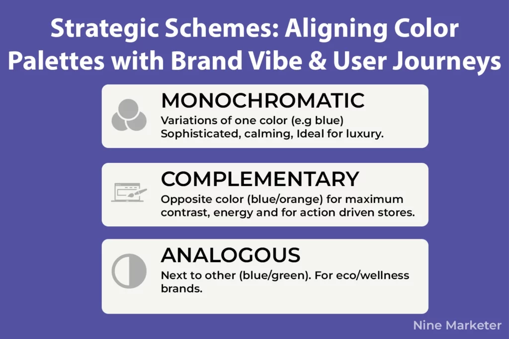
Monochromatic schemes use variations of a single color
Think different shades of blue, and they create this sophisticated, calming vibe that’s perfect for luxury dropshipping stores.
Complementary schemes pair opposite colors like blue and orange or red and green, creating maximum contrast and energy.
These work brilliantly for action-driven stores.
Analogous schemes use colors next to each other on the wheel, like blue, blue-green, and green.
They feel natural and harmonious, which is why they dominate eco-friendly and wellness product stores.
The data on successful stores is eye-opening.
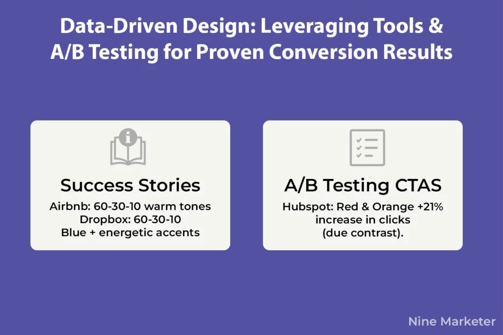
Airbnb color palette nails the 60-30-10 rule with warm, inviting tones dominating 60% of their pages, bold secondary colors for accents, creating that cozy exploration vibe.
Dropbox color palette pairs their signature blue with energetic shades for a clean, professional look that never feels cold.
These aren’t accidents, they’re strategic color distribution that guides users smoothly through the buying journey.
Tools make this whole process way less intimidating.
Adobe Color (formerly Kuler) lets you browse existing schemes or generate your own using the color wheel
Super helpful when you’ve got a logo color and need complements.
Coolors is fast for creating random palettes and tweaking them on the fly.
Canva’s color palette generator is dead simple for beginners. Don’t overthink it
Pick one tool and start experimenting.
A/B testing your color combinations is where you separate amateurs from pros.
HubSpot’s famous test showed a red button outperformed green by 21%, but here’s what most people miss
It wasn’t because red is universally better.
It was because their page already had tons of green, so red created contrast.
Test your CTA button colors first
That’s where you’ll see the biggest immediate impact.
Then test accent colors, then background variations.
Track click-through rates, conversion rates, and time on page.
Some brands have seen conversion increases over 35% just by improving CTA contrast through better color combinations.
The biggest mistake people make is testing random colors without understanding context.
Your button color needs to work within your overall palette, not against it.
Start with the 60-30-10 rule as your foundation, ensure high contrast for actionable elements, and then test variations within that framework.
That’s how you build color combinations that actually convert instead of just looking pretty.
Conclusion
Understanding color psychology for your dropshipping store design isn’t just about making your site look pretty
It’s about strategically using color to influence emotions, build trust, and drive conversions!
From the urgency of red to the trustworthiness of blue, every color choice you make sends a powerful message to your potential customers.
The beauty of color psychology is that you can start implementing these strategies today.
Begin with small tests
Change your CTA button color, adjust your header, or refresh your product page backgrounds.
Then measure the results and iterate.
Remember, there’s no one-size-fits-all solution
What works for a luxury jewelry store might not work for a pet accessories shop.
Your dropshipping store’s colors should tell your brand story,
Connect with your target audience emotionally, and guide visitors seamlessly toward that “Add to Cart” button.
Take the insights you’ve learned here, apply them thoughtfully, and watch your conversion rates climb!
Ready to transform your store design?
Start with one color change today and A/B test your way to success.


