

You open your store on your phone for the first time in weeks.
The hero image takes forever to load. The “Add to Cart” button sits half-hidden under a sticky banner.
You tap it twice, nothing happens, and you close the tab. Sound familiar? Now imagine that’s what your customers see, every single day!
Here’s the uncomfortable truth I’ve seen again and again: most dropshipping traffic arrives on a smartphone, from TikTok, Instagram, or Google, but most stores are still designed, tested, and approved on a laptop.
The result is high bounce rates, abandoned carts, and ad spend that quietly disappears.
A beautiful desktop store means very little if your mobile experience is broken.
In this guide, you’ll learn how to properly test your mobile storefront on real devices, which metrics and tools actually matter, and how to fix the biggest conversion killers, from page speed and product pages to checkout friction.
Let’s get your store ready for the thumb-scrolling crowd.
1. Why Mobile Experience Makes or Breaks Your Dropshipping Store
Here’s a frustrating pattern that shows up in a lot of new stores.
The ads get clicks, the creative looks great, and the carts stay empty.
The problem is often the page the click lands on, and it only shows up when someone opens the store on a phone.
The gap that gives you away
Here’s where it stings.
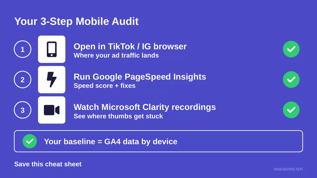
Littledata’s Shopify benchmark shows phone shoppers converting at about 1.2% versus 1.9% on desktop, and that’s across a lot of stores.
Some of that gap is normal, since people often browse on a phone and buy later on a laptop.
But mobile cart abandonment sits near 80%, compared to about 66% on desktop, which tells you plenty of buyers bail mid-checkout. If your own gap is wider than those benchmarks, treat it as a warning light, not a mystery.
Speed is the usual suspect.
Only 48% of mobile sites pass all three Core Web Vitals, so a store that gets this right already has an edge over about half the web.
The toughest of the three is loading speed, with Largest Contentful Paint passing on just 62% of mobile sites, and big unoptimized product photos are a common reason why.
Why Google cares, too
Search engines have picked a side.
With mobile-first indexing, Google uses the phone version of your content for indexing and ranking, and you can’t opt out of it.
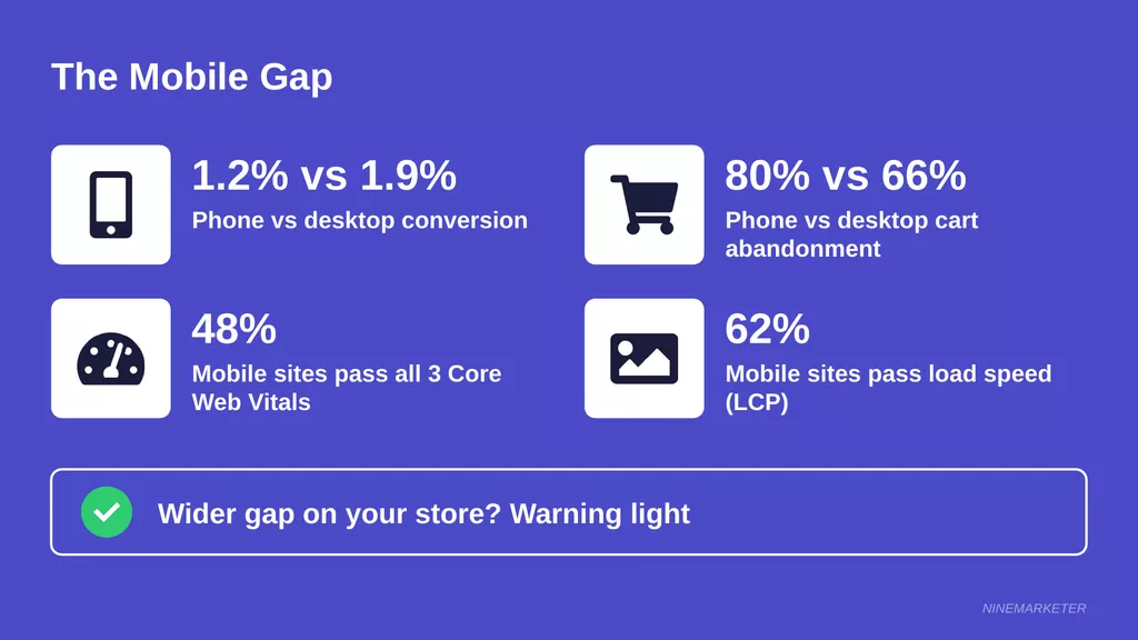
So if your small-screen layout hides product descriptions, trims out reviews, or breaks lazy-loaded images, Google sees that stripped-down version.
That can quietly drag down your product and collection pages in search. Worth checking, because most owners only ever review their store on a big monitor.
Ads, ROAS, and trust all connect
Think of it as a chain.
A clunky phone page pushes up bounce rate, which wastes ad spend, which hurts your ROAS, which tempts you to pause campaigns that might have worked fine with a better landing page.
Trust sits in the middle of that chain.
Shoppers on small screens decide fast, and a jumpy layout, tiny text, or a missing return policy makes a store feel sketchy.
Nobody types card details into a site that feels off.
Here’s a practical move.
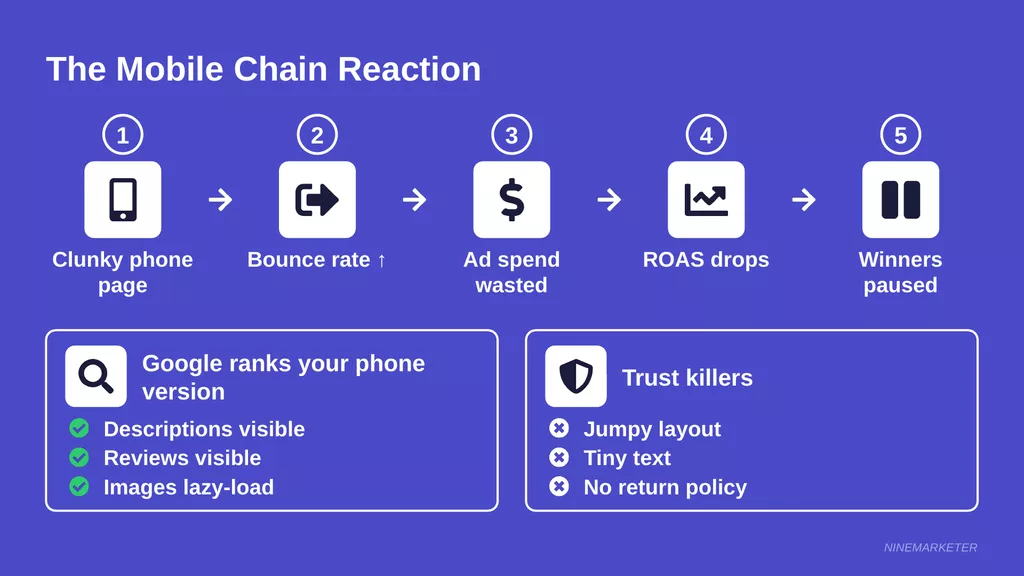
Open your store inside the TikTok or Instagram in-app browser (not just Safari or Chrome), because that’s where your ad traffic actually lands.
Then run the page through Google PageSpeed Insights and watch a few session recordings in Microsoft Clarity to see where thumbs get stuck.
One caution: benchmark reports disagree on mobile conversion rates, and some put the average closer to 2.8%.
Use your own GA4 data by device as your baseline, and treat any published number as a rough guide.
2. Setting a Mobile Performance Baseline Before You Change Anything
Here’s a mistake that wastes weeks.
Compress the images, swap the theme, delete six apps, all in one weekend.
Then sales move a little and nobody can say why.
Pull mobile vs. desktop numbers from GA4
Open GA4 and split your data by device category.
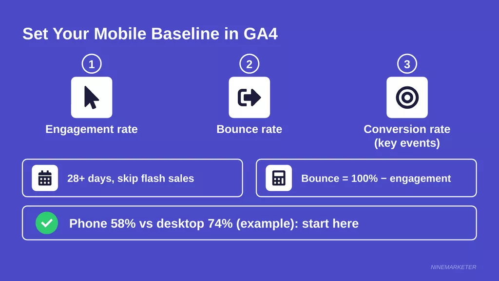
You want three numbers side by side: engagement rate, bounce rate, and conversion rate (GA4 calls conversions “key events” now).
Grab at least 28 days, and skip any weird stretch like a flash sale.
Here’s a gotcha that trips people up.
In GA4, bounce rate is simply the share of sessions that weren’t engaged, and a session counts as engaged if it lasts over 10 seconds, has two or more page views, or triggers a key event.
So bounce rate is 100% minus engagement rate.
Old benchmarks from Universal Analytics don’t apply anymore.
Also, most reports hide both metrics by default, so you’ll need to add them as columns by customizing the report.
Say your phone engagement rate lands at 58% while desktop sits at 74% (made-up numbers, just for illustration). That 16-point gap is your starting line, and it tells you where to dig first.
Find your top mobile landing pages and entry sources
Averages hide the real culprits.
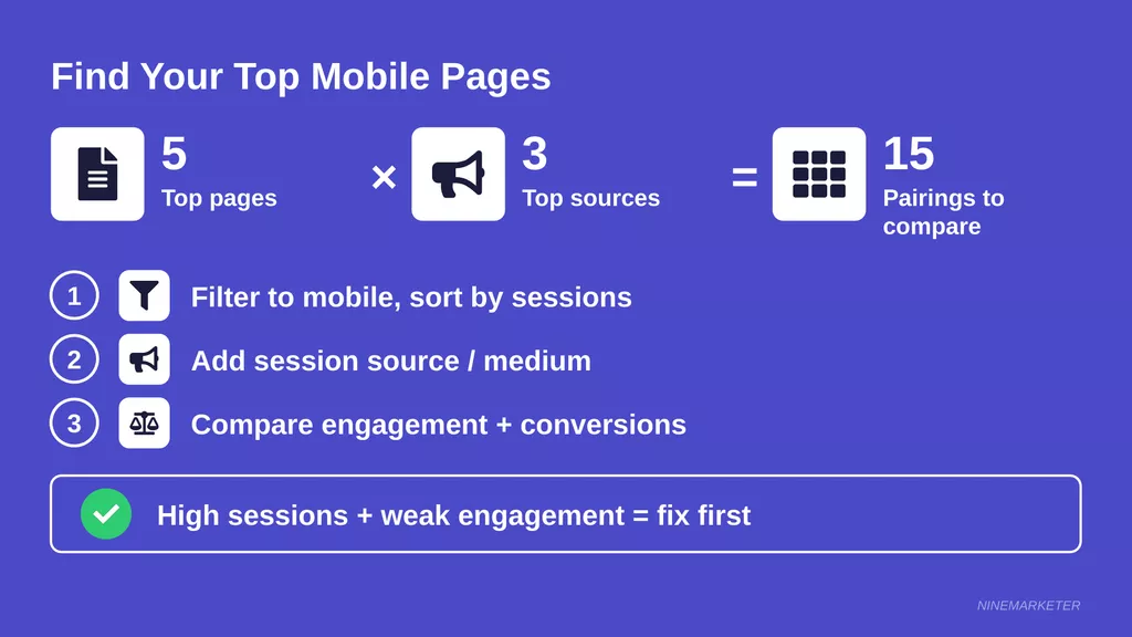
Open the landing page report, filter to mobile traffic, and sort by sessions.
Your top five pages are where your ads and social posts actually drop people, so those matter most.
Next, add session source and medium.
A product page might do great with Google Shopping visitors and flop with TikTok traffic, since in-app browsers behave differently.
Write down your top five pages and top three sources, then compare engagement and conversions for each pairing.
Quick tip: a page with tons of sessions and weak engagement is your first target. Fixing it moves the needle more than polishing a page nobody visits.
Record your Core Web Vitals
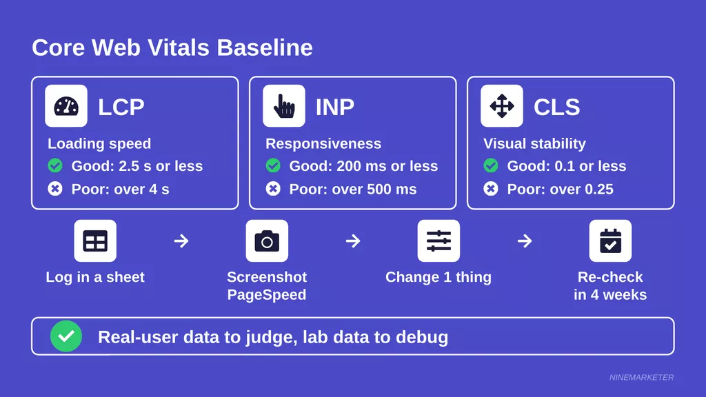
Now for speed. Core Web Vitals are three metrics, and each one is judged at the 75th percentile of real visits. Here’s what “good” looks like:
| Metric | What it measures | Good | Poor |
|---|---|---|---|
| LCP | Loading speed | 2.5 seconds or less | Over 4 seconds |
| INP | Responsiveness | 200 ms or less | Over 500 ms |
| CLS | Visual stability | 0.1 or less | Over 0.25 |
Run each top page through PageSpeed Insights on the mobile tab.
It shows real-user data from the past 28 days plus a simulated lab test.
Those two can disagree, so trust the real-user numbers to judge and the lab test to debug.
Small stores sometimes see no real-user data at all, because a page needs enough traffic to show up.
If that’s you, note the lab numbers and label them as lab.
And don’t expect GA4 to track these metrics out of the box, because it doesn’t.
Document everything so wins can be measured
Build a simple spreadsheet before you touch a single setting.
Add the date, device, sessions, engagement rate, bounce rate, conversion rate, and the LCP, INP, and CLS for each top page.
Screenshot the PageSpeed Insights results too, because those numbers get overwritten as new data rolls in.
Add a notes column for anything you change, like a new app, a theme update, or a fresh ad creative.
Then change one thing at a time when you can.
Wait about four weeks, re-pull the same numbers, and compare, since real-user speed data takes that long to catch up.
3. The Best Tools for Testing Your Mobile Storefront
Ever run your store through five different speed tools and get five different scores?
It happens a lot, and it usually leaves people more confused than before.
The fix is a small, simple stack instead of a pile of apps.
Google’s free trio: PageSpeed Insights, Lighthouse, and Search Console
Start with PageSpeed Insights.
Paste in a product page URL and you get a lab test run through Lighthouse, plus real-user data from the past 28 days when the page has enough traffic.
That score isn’t the same as your Core Web Vitals result.
A score gap of 10 to 15 points between PSI and a local Lighthouse run is normal, so don’t panic when numbers differ.
Pick one tool for your before-and-after checks and stick with it.
Next, open the Core Web Vitals report in Search Console.
It groups similar pages together and splits mobile from desktop using real visitor data.
That’s great for spotting a template-wide problem, like every product page loading slowly, instead of chasing one URL at a time.
Small stores often hit a wall here, though. If there isn’t enough traffic data, you’ll just see “No data available.”
Lean on PSI’s lab numbers for now and check back as traffic grows.
Chrome DevTools: great for quick checks, not the final word
Right-click any page in Chrome, hit Inspect, and toggle the device toolbar.
Boom, you’ve got a phone-sized view in seconds, plus options to slow down the CPU and network.
It’s free, fast, and perfect for catching broken layouts.
But Chrome’s own docs call device mode a first-order approximation, not a real phone.
CPU throttling can’t copy every part of mobile hardware, and collapsing URL bars from real mobile browsers don’t show up either.
Use it for spot checks, then confirm on an actual device.
Real devices: cloud labs vs. the phones in your pocket
Cloud platforms like BrowserStack let you open your store on real iPhones and Android phones from your laptop, including Safari on iOS and network throttling.
LambdaTest does something similar, but it offers a mix of real devices and emulators depending on plan.
So double-check you’re on a real device before trusting a result.
These services cost money, and free trials are usually limited, so save them for a specific job, like testing checkout on an older iPhone.
For everyday checks, your own phones win.
Keep one recent iPhone and one budget Android around, and test on mobile data, not just Wi-Fi.
Heatmaps and session recordings: see what shoppers actually do
Numbers tell you what happened.
Recordings show you why.
Watching a shopper jab at a button that does nothing hits way different than reading a bounce rate.
Microsoft Clarity is free with no traffic limits, and it lets you filter recordings by device, traffic source, rage clicks, and dead clicks.
Hotjar is a solid alternative, but its free plan has daily session caps, so you only see a slice of your visitors.
For a small dropshipping store, start with Clarity.
Heads up on checkout pages.
One setup guide says recording checkout is limited to Shopify Plus, so test it before you count on it.
And watch about ten mobile sessions that ended with no add-to-cart, because that’s where the patterns pop out.
Built-in reports: Shopify and WooCommerce
Don’t sleep on what your platform already gives you.
Shopify analytics shows sessions by device, gross sales by device, and conversion rate with zero extra setup.
Which reports you see depends on your plan, though.
On WooCommerce, order attribution saves the device type for every order, and it’s been on by default since version 8.5.
The catch is that it only covers orders placed after it was turned on.
For ready-made charts, the WooCommerce Analytics add-on includes an Orders by device report.
Expect small mismatches between these numbers and GA4, since each tool counts sessions its own way.
That’s fine.
Just compare each tool against itself over time.
Quick cheat sheet
| Job | Tool | Cost |
|---|---|---|
| Speed and Core Web Vitals | PageSpeed Insights, Search Console | Free |
| Quick layout checks | Chrome DevTools | Free |
| Real-device checks | Your own phones, BrowserStack, LambdaTest | Phones free, cloud labs paid |
| Shopper behavior | Clarity, Hotjar | Clarity free, Hotjar free plan capped |
| Sales by device | Shopify or WooCommerce reports | Built in (add-on for Woo charts) |
A simple routine keeps this manageable. Check PSI and Search Console monthly, test on a real phone after every theme or app change, and watch a handful of recordings each week.
4. How to Run a Real-World Mobile UX Audit
Your store feels smooth on your own phone.
That’s the trap.
You’re probably on a recent device with good Wi-Fi, and you already know where everything is.
Test across devices, screen sizes, and browsers
Start with the two browsers that matter most, which are Safari on iPhone and Chrome on Android.
Then add one small screen, one big screen, and one older or budget phone, since low-end hardware shows lag that a new device hides.
Desktop Chrome can’t fully stand in for the real thing.
Mobile browsers have quirks, like URL bars that collapse on scroll and change the viewport height, so do a final pass on real WebKit for your key flows.
Also open your store from a link inside TikTok or Instagram, because that in-app browser is where your ad traffic lands.
Test on slow connections
Fast Wi-Fi hides a lot of sins.
Shoppers on trains, in rural spots, or in places with spotty coverage deal with sluggish loads all day, so you need to feel that pain yourself.
In Chrome DevTools, open the Network tab and pick a throttling preset.
Slow 4G adds about 562 ms of latency per request and limits speed to roughly 1.4 Mbps.
Tick “Disable cache” too, so you see the first-visit experience, like a brand-new shopper from an ad.
DevTools throttling is only an approximation, though.
So also try your real phone on mobile data with Wi-Fi switched off.
Watch what shows up first, and note any blank hero images, jumping layouts, or buttons that freeze for seconds.
Walk the buyer journey, step by step
Follow the path from ad click to order confirmation, one stage at a time.
Jot down a pass or fail for each line.
- Landing: Does the main image appear fast (aim for an LCP under 2.5 seconds)? Does the headline match the ad? Can you see the offer without scrolling?
- Browse: Can you open the menu with one thumb? Do search and filters work? Do collection pages scroll smoothly?
- Product: Can you spot the price, reviews, shipping time, and return policy without hunting? Is the Add to Cart button easy to find? Do image swipes work?
- Cart: Are shipping costs and totals clear? Can you change quantity without mis-tapping? Is the checkout button obvious?
- Checkout: Is guest checkout available? Do wallets like Apple Pay or Shop Pay show up? Does the right keyboard pop up for email and phone fields, and do error messages say what to fix?
Give the last two stages extra time.
Baymard’s research, as summed up by Contentsquare, puts average cart abandonment at just over 70%.
It also points to forced account creation and complicated checkouts as big reasons shoppers leave.
Run quick usability sessions
You’re too close to your own store.
Fresh eyes catch the stuff you’ve gone blind to, and five users is the classic starting point from Nielsen Norman Group.
Run a round, fix what you find, then test again with new people.
Recruit friends, past customers, or folks from a social group.
Mix ages and phone types, and tell everyone you want honest feedback, since friends tend to be polite.
A small thank-you, like a discount code or a coffee, goes a long way.
Keep each session to about 15 minutes on their own phone.
Give one task, like “find a gift under $30 and get to the payment screen,” and ask them to think out loud.
Then zip it, and don’t help, even when it’s painful to watch.
Spot the red flags
Three problems show up again and again on small-screen stores.
Here’s a quick way to catch each one:
| Red flag | How to spot it | Quick fix |
|---|---|---|
| Tiny tap targets | You mis-tap links, icons, or size swatches | Bigger buttons with space between them |
| Intrusive pop-ups | A big overlay blocks the page right after landing | Delay it, shrink it, or use a small banner |
| Horizontal scrolling | The page slides sideways when you swipe | Find the too-wide element and make it fit |
On tap targets, Shopify’s theme guidance recommends at least 48 × 48 px with about 8 px of space between them.
The Lighthouse tap targets audit flags anything smaller that sits too close to its neighbor.
Swatches, quantity buttons, and tiny “x” icons are the usual offenders.
On pop-ups, Google has treated intrusive interstitials as a negative mobile ranking factor since 2017.
Legally required notices, like cookie consent, are exempt.
So keep newsletter and discount pop-ups small, and hold them back until someone has interacted with the page.
For sideways scrolling, swipe left and right on every key page.
The usual culprits are wide size-chart tables, oversized images, and banners with fixed widths.
Fix one, then retest, because these bugs love to hide in pairs.
Once you’re done, add every problem to your baseline spreadsheet with a screenshot and a priority.
Then repeat the audit after any big theme or app change.
5. Speeding Up Your Store: Mobile Page Speed Optimization
Got a bad speed score?
The first instinct is to install a “booster” app.
Here’s the catch: that app is one more script your store has to load.
In the same section, the supplier subsection also starts with “Imagine importing a product…”
Replace that sentence with this: “Supplier imports often arrive with a description made of 30 stacked images, messy nested code, and a GIF heavier than your whole homepage.”
Compress and lazy-load product images
Images are usually the heaviest thing on a product page, so start here.
Modern formats help a lot, and one independent test found WebP files about 31% smaller than JPEGs at the same quality, with AVIF around 50% smaller.
Results vary by image, but the direction holds.
On Shopify, the platform serves AVIF or WebP automatically, based on the shopper’s browser.
So your best move is uploading well-sized, properly compressed originals instead of giant camera files.
Don’t upload an image much wider than it will ever be displayed.
Then add lazy loading for images below the fold, but never on the main image people see first.
Shopify’s docs say to never lazy-load that top image, and to mark it with fetchpriority set to high instead.
Also watch out for fade-in effects, since they can delay your Largest Contentful Paint by seconds even after the image has downloaded.
Cut app and plugin bloat
Many apps inject their own JavaScript and CSS into your storefront.
Chat widgets, review tools, pop-ups, loyalty programs, and tracking pixels are the usual suspects.
List everything that’s running, then ask one question about each: does this earn its keep?
Here’s a gotcha that bites people.
Store owners report leftover code sticking around after an app is uninstalled, and even duplicate Facebook pixels firing three or more times.
So after removing an app, search your theme files for its name.
Check that each pixel fires once, using a pixel helper browser extension.
And remove one thing at a time, then re-test, so you know what actually helped.
Pick a lightweight theme and trim your fonts
Your theme is the foundation, so test before you commit.
Run the theme’s demo store through PageSpeed Insights on mobile first.
Shopify requires themes in the Theme Store to average a Lighthouse score of at least 60, but that’s a floor, not a goal.
Fonts are sneaky, too.
Google’s font best practices say to use WOFF2, subset your fonts to the characters you need, and set font-display to swap so text appears right away.
Stick to one or two families and only the weights you actually use.
Preload with care, because it can backfire.
Caching, CDN, and clean code
Good news for Shopify owners.
Shopify’s CDN is built in, runs on Cloudflare, and automatically minifies and compresses files with Brotli and gzip.
You don’t need to bolt on your own, so your job is keeping the code riding on it lean.
WooCommerce works differently.
You’ll need a caching plugin, and WooCommerce’s caching guide says to exclude the Cart, Checkout, and My Account pages from the cache.
Those pages show info specific to each customer, so caching them can cause weird bugs at the worst possible moment.
For clean code, run PageSpeed Insights and look at the unused JavaScript and render-blocking items it lists.
Those point straight to the files worth chasing. Fix the biggest one first, then re-test.
Handle heavy supplier descriptions and GIFs
Imagine importing a product and finding a description made of 30 stacked images, messy nested code, and a GIF heavier than your whole homepage.
Import tools produce this stuff all the time.
It looks fine on a laptop and crawls on a phone.
Start with the page structure.
Lighthouse warns when a page has more than about 800 DOM nodes and flags errors past roughly 1,400, and messy copied HTML piles those up fast.
Paste the description into plain text, rewrite it in your own words, and keep just a few optimized images.
That also helps SEO, since you’re no longer duplicating every other store selling the same item.
Next, swap GIFs for video.
In one web.dev GIF example, a 3.7 MB GIF shrank to 551 KB as an MP4 and 341 KB as a WebM.
A muted, looping video that plays inline looks the same to shoppers.
If you can’t convert it, replace the GIF with a still image.
After each change, re-run PageSpeed Insights on your top pages and log the results next to your baseline numbers.
6. Designing Product Pages That Convert on Small Screens
Great product photos can’t save a bad page.
On a phone, the Add to Cart button is buried, the description is a wall of text, and the shipping time hides in fine print.
Shoppers notice all of it in a few seconds.
Image galleries that work with swipe and pinch-to-zoom
Shoppers judge a product by its photos, and they expect them to behave like photos on their phone.
Baymard’s testing found that mobile users keep trying to pinch and double-tap, yet 40% of mobile sites don’t support those gestures.
Even sites that did often served low-resolution images, which ruined the point of zooming.
So make sure the gallery loads a sharper version when someone starts zooming.
Swiping should feel instant, too.
Baymard also found that people lean on swipe, and that dot indicators are hard to tap, so thumbnails work better for showing there’s more to see.
Aim for a mix of images: a clean main shot, a close-up, a lifestyle photo, and one showing the product in scale or in a hand.
Then test the gallery on your own phone with one thumb.
Short, scannable descriptions and benefit-led copy
Here’s a twist: shorter isn’t always better.
Baymard found that every single tester relied on the product description at some point, so thin copy hurts as much as a wall of text.
Their research also shows that structuring copy by feature highlights keeps people engaged, yet 78% of sites skip it.
Lead with the benefit, not the spec.
Open with two or three lines that say what the product does for the buyer and who it’s for.
Then add a short bullet list, and tuck the extras, like specs, care, and shipping, into collapsible sections.
Keep that hidden text in the page code so search engines can still read it.
And rewrite supplier copy in your own voice, because “durable polyester” tells nobody how their morning gets easier.
Sticky Add-to-Cart buttons and thumb-friendly layout
Most people hold their phone in one hand, so the easy-to-reach zone sits near the bottom of the screen.
A sticky Add to Cart bar keeps the main action in that zone while shoppers read.
It can also show the price, so nobody scrolls back up to check.
But don’t assume it’s a guaranteed win.
In one test, a sticky button lifted add-to-cart rate by 3.9% and conversion by 6.2%.
In another test, add-to-cart rate rose 8.7%, but conversion and revenue went down.
The lesson is to test it on your own store.
Also check that the bar doesn’t cover a cookie banner, chat bubble, or variant picker.
Keep the order simple: title, price, rating, delivery estimate, variants, then the button.
Trust signals on mobile
On a small screen, doubt creeps in fast.
Reviews are your strongest answer, and research from Northwestern’s Spiegel Research Center found that a product with five reviews had 270% higher purchase likelihood than one with none.
The effect was even bigger for pricier items.
Show the star rating and review count right under the product title.
Photo reviews and verified-buyer labels add extra weight.
And skip the fake ones, since a believable mix of ratings looks more real than a perfect score.
Next, put shipping time and return policy near the button, as short lines that open a small pop-up for details.
Add recognizable payment options like Apple Pay or Shop Pay, plus a few real security badges.
That matters because nearly one in five shoppers leave when they don’t trust a site with their card details.
Handling long shipping times transparently
Dropshipping often means slower delivery, and that’s okay if you’re upfront about it.
The real killer is surprise.
A shopper who expects two days and gets three weeks turns into a refund request.
Baymard found that people stall when they only see a shipping speed, and that clear delivery dates work better.
They also warn that padding the estimate too much makes delivery look slow, while padding too little breaks the promise.
So pick an honest range that includes processing and transit.
Show that date range right next to the Add to Cart button, like “Arrives Oct 21 to Nov 4.” Repeat it in the cart, at checkout, and in the confirmation email.
Then send tracking updates so nobody wonders where their order went.
The stakes are real, since about 21% of shoppers abandon carts because delivery is too slow.
Being honest costs you a few sales upfront, but it saves refunds, chargebacks, and angry emails later.
Also check the shipping and consumer rules wherever you sell.
Pick one change at a time, then compare the results against your baseline numbers. Small wins stack up quickly.
7. Streamlining Navigation, Search, and Collection Pages
Ever tapped a menu on your phone and given up after five seconds?
Your shoppers do the same thing.
They don’t leave a bad review, they just go back to Instagram.
Simplified menus: hamburger vs. bottom navigation
The hamburger icon saves space, but it hides your options.
Nielsen Norman Group’s testing found that hidden navigation is less discoverable and makes tasks feel harder.
That doesn’t mean you should ditch it.
It means you shouldn’t hide everything behind it.
A simple middle path works well.
Keep the menu icon, but show two or three high-value shortcuts right in the header, like Search, Cart, and your best-selling collection.
That way the most common taps are never buried.
What about a bottom bar?
Bottom navigation is designed for three to five top-level destinations of equal importance, and those rules were written with apps in mind.
On a mobile website, it can crowd your cookie notice, browser toolbar, and sticky Add to Cart button.
For most dropshipping stores, a clean top header plus a tidy menu is the safer bet.
Whichever you choose, use plain words. Label a collection “Dog Beds,” not “Comfort Collection,” and give every menu link a big, easy tap area.
Smart on-site search with filters that work on mobile
Shoppers who use search usually know what they want, so a bad search page is a lost sale.
Baymard found that 69% of sites don’t handle misspelled searches well in their autocomplete.
Test yours by typing “sneekers” or “wireles earbuds” and seeing what comes back.
Also give people a dead-end escape.
A “no results” page should offer popular collections instead of a blank screen.
Baymard’s research also notes that niche direct-to-consumer stores rarely need fancy search, so if your catalog is tiny, polish your menu and collections first.
Filters are where phones struggle most.
On mobile, they usually live on a separate screen, so shoppers bounce back and forth between the list and the filter panel.
One fix is showing your promoted filters right above the product list, yet Baymard found 61% of sites don’t.
Make filter options big enough to tap, show which ones are applied, and add a clear button like “Show results (24).”
Then make sure tapping a filter responds fast.
If the page freezes for a second, that’s an INP problem worth fixing.
Collection page layout: grid density, sorting, and fast filtering
A two-column grid is the usual starting point on phones.
It shows more products per scroll, which suits items people choose by looks.
If your products need details like size or material, test a one-column list instead.
How many products load at once matters too.
Baymard recommends loading about 15 to 30 products at a time on mobile, and it says a “Load more” button generally performs best.
Endless scrolling can hurt usability, especially on mobile and search results.
Keep the first few product images loading right away, and lazy-load the rest further down.
Put the sort menu and filter button together in one easy-to-reach row at the top.
Use clear sort options like Best Selling, Newest, and Price, and set a sensible default.
Reducing pop-ups and banners that block content
Mobile stores love stacking overlays.
There’s an announcement bar, a cookie notice, a discount pop-up, a chat bubble, and a sticky button, and suddenly a quarter of the screen is gone.
Google has treated intrusive interstitials as a negative mobile ranking factor since 2017, with exceptions for legally required notices.
Pick one pop-up at a time, and hold it back until someone has scrolled or spent a bit of time on the page.
Use a small banner instead of a full-screen takeover, and give it a big, easy close button.
Skip pop-ups on checkout, and don’t hit people with one the second they land from an ad.
Move the chat bubble so it never covers Add to Cart.
And place the cookie notice at the bottom using fixed positioning, since web.dev explains that this avoids layout shifts.
Then do a quick gut check: open your store in a private tab and count how many things block the screen in the first five seconds.
Pick one fix, make the change, and compare it against your baseline numbers before moving on.
8. Fixing Mobile Checkout Friction and Cart Abandonment
Roughly 70% of shopping carts never turn into orders, according to Baymard’s 2026 roundup of abandonment studies.
On a phone, the number tends to be even uglier.
Every extra tap, field, and surprise fee gives a shopper another reason to bail.
Here’s how to tighten each step between the cart and the confirmation page.
One-page vs. multi-step checkout on mobile
People love to argue about this one, but the page count isn’t the real issue.
In Baymard’s 2026 data, 17% of US shoppers said they had abandoned an order in the past quarter because the checkout was too long or complicated.
Its testing shows an ideal checkout can be as short as 12 to 14 form elements, or 7 to 8 real fields.
Yet the average US checkout shows 23.48 elements by default.
Baymard says most stores could make a 20-60% reduction in how many elements they show.
Cutting fields beats debating page counts.
If you’re using an accordion-style checkout on WooCommerce, know that shoppers see it as multiple steps and expect the back button to return them to the previous section.
On Shopify, the checkout layout is mostly set by the platform, so your control comes from settings, not code.
Test your own flow on a real phone and count the taps from cart to payment.
Express payment options: Apple Pay, Google Pay, Shop Pay, and PayPal
Wallets let shoppers skip typing entirely.
On Shopify, dynamic checkout buttons can send people from the product page straight to checkout, and they cover Shop Pay, Apple Pay, Google Pay, and PayPal.
Which button a shopper sees depends on your payment settings, their browser, their device, and their payment history, so don’t expect every wallet to show for everyone.
Shopify’s own pitch is big, too.
Shopify says Shop Pay can lift conversion by up to 50% compared to guest checkout.
That’s the company’s claim, so treat it as a ceiling, not a promise.
Turn on every wallet your payment provider supports, then test on an iPhone in Safari and an Android phone in Chrome.
Put the buttons near Add to Cart and at the top of the cart.
And watch out for a sneaky trap: setting the company name field to required can hide some accelerated options like Apple Pay.
Autofill, numeric keyboards, and fewer form fields
Typing a 16-digit card number on a full letter keyboard is miserable.
Google’s form best practices say to use the right input types so phones show the right keyboard, like email and phone fields.
Card numbers should trigger a number pad too, and proper autocomplete labels let the browser fill in addresses and cards.
The same guide says guest checkout should be the default, with account creation offered after the purchase.
And label the button with what happens next, like “Proceed to Payment,” not a vague “Continue.”
If you’re on Shopify, much of this is handled for you.
Your job is trimming fields in checkout settings.
Make the phone number optional if shoppers drop off there, hide the company name, and keep address line 2 optional.
Then run a quick test.
Check out using your phone’s saved card and address, and see whether autofill actually fills everything.
Show shipping costs and taxes early
Surprise costs are the classic cart killer.
In Baymard’s abandonment data, 40% of shoppers who weren’t just browsing cited extra costs being too high, and another 12% couldn’t see the total cost up front.
A further 20% blamed slow delivery. The fix is simple: no ugly surprises on the last screen.
The rest of the subsection stays the same, including the link on “estimated shipping costs.”
Abandoned cart recovery via email and SMS
Some shoppers will still leave, so set up a safety net.
On Shopify, you can send abandoned checkout emails automatically, though they won’t go out for checkouts on POS or third-party channels.
Community reports also say automatic emails may not reach shoppers who haven’t agreed to marketing, so check the tooltips on your Abandoned checkouts page.
Don’t expect miracles, but the numbers add up.
Omnisend’s 2025 data put abandoned cart emails at about 36% opened and about 1.5% converted.
That’s a lot of recovered orders for emails that cost almost nothing to send.
Send the first email within about an hour, and a second one the next day.
Show the item they left behind with one clear button, and hold the discount for a later email.
Stop the sequence the moment an order comes in.
SMS can work as a second nudge, but it needs express written consent in many places, plus limits on how often you text.
Rules differ by country, so check the ones where your buyers live.
Keep it to one short message after the first email.
Make one change at a time, then compare your checkout numbers against your baseline.
9. A/B Testing and Continuous Mobile Optimization
Most A/B tests don’t win. In VWO’s 2026 dataset of 193,000 experiments, the average win rate sat around 10%, so roughly nine in ten tests didn’t beat the original. That’s not a sign you’re doing it wrong. It’s how testing works.
The real goal is learning faster than your competitors, one clean test at a time. Here’s how to pick what to test, run it properly on phones, and keep watch every month.
What to test first
Start where traffic and money meet. Open your baseline and look at your top mobile landing pages, then work down the path from hero section to product page, cart, and checkout.
Hero section. Match the headline and first image to the ad people clicked, and keep the main offer visible without scrolling.
CTA placement. Compare an inline Add to Cart button with a sticky bar. Results here are mixed, which is exactly why it needs a real test.
Product images. Change which photo leads the gallery, like a close-up versus a lifestyle shot.
Checkout options. Try showing wallet buttons on the product page versus only in the cart. Shopify lets you show or hide accelerated checkout buttons, so this one is easy to set up.
Write a one-line hypothesis before you start, like “Because recordings show people hunting for the button, a sticky bar will raise purchases.” Then pick one primary metric tied to money, such as conversion rate or revenue per visitor, not just clicks.
Running mobile-specific experiments and reaching significance
Test phones on their own. CXL argues that what wins on desktop often doesn’t win on mobile, so it recommends separate mobile tests. Elements that only exist on phones, like sticky bars and drawer menus, need device-specific tests, and slicing results by device after the fact adds another chance for a false positive.
Sample size depends on four things: your baseline conversion rate, the lift you want to catch, 95% significance, and 80% power. One sample-size guide shows that a 3% baseline needs about 13,900 visitors per variant to catch a 20% lift, while a 1% baseline needs about 42,600. At the 1.2% mobile average Shopify stores see, the same formula needs roughly 35,000 mobile visitors per variant.
Plug your own numbers into Evan Miller’s calculator. Run the test for at least two full business cycles, which usually means two weeks, and stop only when you hit your planned sample. Peeking at results and calling a winner early inflates your false-positive rate.
If your store can’t reach those numbers, don’t force it. Test bigger swings on your busiest pages, run fewer but longer tests, and just fix obvious problems like tiny tap targets without a test at all. Use recordings and surveys to find ideas worth testing later.
As for tools, Google Optimize is retired. Shopify testing tools like Shoplift and Intelligems have filled the gap, with Convert and VWO as heavier options. Whichever you pick, check that it doesn’t slow your pages, since speed is what you’re protecting.
Prioritizing fixes by impact vs. effort
Your idea list will pile up fast, so score each one and stop arguing. ICE and PIE are quick options. ICE rates Impact, Confidence, and Ease from 1 to 10, while PIE rates Potential, Importance (how valuable the traffic is), and Ease.
The PXL framework from CXL is less subjective, because it asks yes-or-no questions about data and page placement. For a small store, ICE is plenty.
Here’s a made-up example. Turning on Apple Pay and Shop Pay on product pages might score 7 for impact, 7 for confidence, and 9 for ease, for a total of 23. Rewriting every product description by hand might score 5, 5, and 2, for a total of 12. The wallet change goes first.
One more rule: fix first, test second. Obvious problems like a slow hero image or a broken filter don’t need a test. Judgment calls do.
A monthly review routine
Pick a recurring slot, like the first Monday of the month, and do the same steps every time so the trends line up. Start by pulling your GA4 numbers by device, including engagement rate, bounce rate, and conversion rate. Compare the same 28-day period to the month before.
Next, check Core Web Vitals. Open the Search Console Core Web Vitals report, then run your top five pages through PageSpeed Insights. Its field data covers a 28-day window, so fixes take weeks to show up, and CrUX Vis charts the weekly trend over the past 40 weeks.
Then spend ten minutes on a real phone with Wi-Fi off, and watch about ten recordings of mobile sessions. Finally, review your test log, note what you learned, pick the next one or two tests, and update your baseline sheet. Re-check right after any theme or app change too, because a new app is a common cause of sudden slowdowns.
A few clean wins a year, with no slowdowns sneaking in, beats a big redesign every time.
10. Mobile Ads, Landing Pages, and Social Traffic Alignment
Not every paid click becomes a visit.
Meta reports landing page views separately from link clicks, because slow mobile sites and weak connections cause many people to lose interest after tapping an ad.
One reference updated in July 2026 puts the typical range at 70 to 90% of link clicks.
If your number sits well below that, you’re paying for clicks that never see your page.
The rest of this section is about closing that gap and tracking what happens next.
Matching ad creative to the mobile landing page
Start with the handoff.
Open your ad on your phone, tap through, and compare what you see.
The headline, first image, offer, and price on the page should echo the ad, because a mismatch makes people wonder if they landed in the wrong place.
Keep the details identical, too.
If the ad shows a discount, the first screen of the page should show the same one.
If the video features one product, don’t send people to a collection page with fifty.
The stakes are high on phones.
Unbounce’s benchmark report found that about four in five landing page visits happen on mobile, yet conversion rates run roughly 40% lower than desktop.
That data covers Q4 2024, so treat it as a direction, not a target.
Dedicated mobile-first landing pages for TikTok and Meta ads
Sending ad traffic to your homepage is like answering a specific question with a store tour.
Build one dedicated page for each ad angle instead, with one product, one offer, and one main button.
Lay it out for thumbs.
The hero matches the ad, a few short benefit lines come next, then reviews, the delivery date, and a sticky Add to Cart button with wallet buttons.
Skip the full navigation menu, since extra links give people more ways to wander off.
TikTok viewers arrive in the middle of a video scroll, so a page that opens with similar footage feels like a continuation.
Meta traffic spans Facebook and Instagram, so break your results down by placement and device.
And keep every page light, because a slow dedicated page wastes ad money faster than a slow homepage.
In-app browser quirks and how to test them
Tapping an ad link in Instagram, Facebook, or TikTok usually opens your page inside the app’s own browser, not Safari or Chrome.
That matters because the page can behave differently.
Shopify merchants have reported that Apple Pay and Google Pay go missing when visitors arrive from Instagram or Facebook.
One QA team’s test checklist says wallet availability depends on browser support, OS support, and sometimes the app’s own integration.
So don’t assume Apple Pay shows up just because it does in Safari.
Logins and saved info can fail too, since an app-contained browser may not share the state your site expects.
Test the real path.
Send yourself the actual ad, or a link in a direct message, and open it inside the app on both an iPhone and an Android phone.
Walk through landing, add to cart, wallet buttons, discount codes, and payment.
Then repeat in Safari or Chrome and compare, because anything that works only in the second one is a leak.
Then watch real sessions.
Filter your Microsoft Clarity recordings by traffic source and see where social visitors get stuck.
Some tools prompt visitors to reopen the page in their regular browser, but that adds a tap, so test whether it actually helps before rolling it out.
Tracking mobile conversions accurately
Ad platforms can only optimize for what they can see.
Meta recommends sending the same events from both the browser pixel and your server, which it calls a redundant setup.
Matching them with an event ID and event name lets Meta discard repeats it spots within 48 hours, and Events Manager shows an Event Match Quality score so you can see how well your events connect.
TikTok works the same way.
If you send the same event through both the Pixel and the Events API, TikTok’s deduplication rules require a shared event ID, and it keeps the first copy it receives.
Duplicates also come from installing a pixel twice, once through a sales-channel app and once pasted into your theme.
Check each pixel with the platform’s test tools and make sure every purchase fires once.
Clean UTM tags help GA4 tell the truth.
UTM parameters are case-sensitive, so “pinterest” and “Pinterest” show up as two sources, and Meta can build UTM links right inside the ad platform.
Use the same lowercase names every time, like utm_source=tiktok, utm_medium=paid_social, and utm_campaign=dog-bed-hook-1.
Watch your medium values, too.
An unusual one can land in Unassigned in GA4’s channel groups, and a missing campaign shows up as “(not set).”
Also keep UTM tags to external campaigns only, and test that your tags survive any redirect.
Expect your ad platforms to report more conversions than GA4.
Compare trends over time instead of expecting the totals to match, and check Meta’s landing page views against GA4 sessions.
A big gap points to slow loading or blocked tracking.
Add the ad-to-page check, an in-app test, and a quick look at your event health to your monthly review.
Your Mobile Optimization Action Plan
- Recap: baseline, test on real devices, speed, product page, checkout, iterate
- Start with the three highest-impact fixes this week (speed, sticky CTA, express checkout)
- Encourage setting a recurring monthly mobile audit
- CTA: grab a phone, walk through your own buyer journey today, and share findings or subscribe for more dropshipping optimization guides